When you go to
Postcrossing , you realize how many people can go crazy for one simple idea. It was the capturing simplicity of the idea that became the main factor why I took up the implementation of one specific crossing with my
ladies and preference exchange objects and additional functionality.
Idea
It was January 2017. Once, one person in a conversation with me mentioned that he would like to realize the idea of sharing
baubles (the so-called "friendship bracelets") on the principle of Postcrossing: the user visits the site, presses a button - gets the address to which he should send the bauble woven by him , after which he himself begins to receive baubles from other users in response (and so on in a circle). It is desirable that the exchange was possible between different countries.
Then I already had about 5 years of experience in developing web applications in Java and a little bit in PHP. When I was described the functionality necessary to work the desired crossing, I thought of using my old PHP practices and doing the project in about two weeks or a month in a month. But, as is often the case, my estimates were too optimistic. Already during the re-reading of the source code of my template engine for PHP, I was
scared of what I had
written, and realized that these old university crafts require
immediate sending to the scrap for at least good optimization.
The more I immersed in my old PHP sources, the more I realized that with my level of proficiency in this language and the state of source codes even this small project would hurt me. That's why I decided to use the Spring Framework, which has become a warm and soft moss for me over the years with Java Web. I did not want to do this initially because of the seeming lack of scale. Of course, I was wrong, so the decision to use the familiar Java language turned a potential pain into a subsequent pleasure.
Design
Since the idea was not mine, during the design, I often and a lot pulled the author of the idea to be sure that my vision of the project corresponds to the author's idea. In the course of lengthy discussions, I was filled with the project and already began to introduce various convenient and useful buns for users and administrators. The design was given due attention: we discussed every detail of the functionality, drew layouts of almost all pages, kept documentation describing the logic of the application and user functionality.
Layouts and documentation constantly evolved, overgrown with details and new functionality. Subsequently, the layouts became one of those things that showed how wrong I was with the assessment of the complexity of the project.
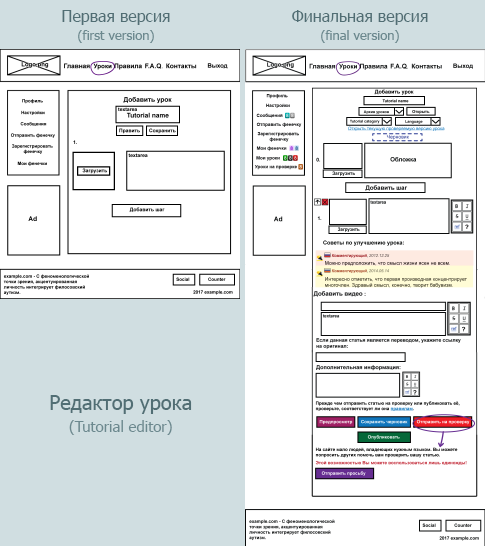 An example of the evolution of the lesson editor page layout
Of course, I myself am to blame for the subsequent complexity of the functional, thereby increasing the development time. However, I didn’t want another
govnosite to appear on the Internet
, thousands of which are of poor quality; I wanted to make the site enjoyable for users both in terms of ease of use and visually. Moreover, perfectionism in me simply did not allow to use the “herak-herak-and in production” method. Therefore, we even worked out the page layouts with scrupulousness (and you will still see that this was far from the limit of confusion over the elaboration of details).
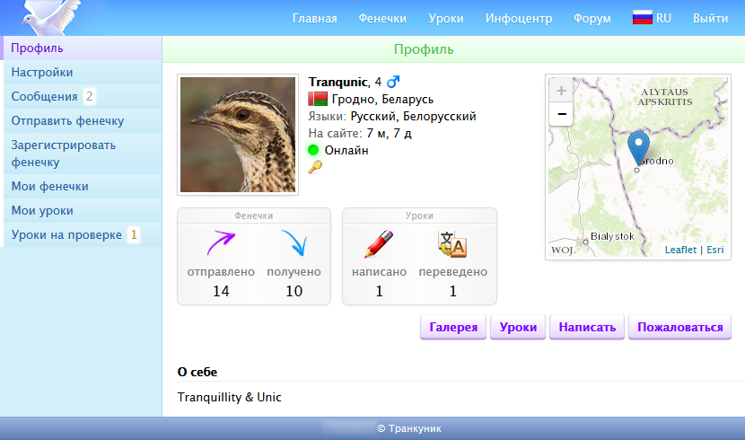
 User Profile Settings Page Layout
Reaching the optional functionality, which I was planning to use alone, I began to draw layouts by hand on a graphic tablet.
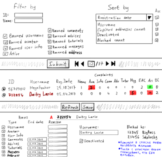 Layout of the "Users" page in the admin panel
During the design, we tried to think over the system so that after launching our further involvement in the life of the site was minimal; we really did not want to engage in the moderation of content published on the site by users, and even more so to hire moderators. We wanted the community to decide for itself which lesson to publish, which bauble to prevent from public, which user to ban for an obscene profile or comments. Of course, we didn’t completely get rid of this, but in the end we managed to at least relieve ourselves of the potential routine.
At the end of the design phase, I realized that we had done the work for at least six months. Moreover, besides the possibility of sharing baubles, we decided to add the possibility of writing articles on weaving baubles (and later on needlework as a whole) and checking these articles by the community itself (later this feature turned out to be even more difficult and long to implement than the exchange system) . But in general, I liked the way it worked “on paper” and looked on mock-ups, so I started the implementation and decided to bring it to the end.
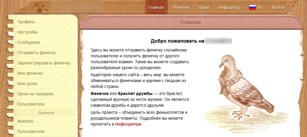
So, according to our idea, the application should have the following
basic functionality :
- Registration on the site and setting up an account;
- The organization of the exchange of baubles with people around the world;
- writing lessons, checking and approval of their community site;
- pages with a specific lesson and a bauble;
- page with a list of lessons and baubles;
- Commenting lessons and baubles;
- event notification system;
- system of complaints, bans and quotas;
- chat between users;
- site statistics;
- admin panel
In addition, the site should initially be focused on an
international audience : the exchange can be carried out around the world, the lessons can be written in any language, and the site itself can be localized into any language (of course, if there are translators who want to do this; for that later I even wrote a small application with which you can conveniently translate the site into a carrier language).
It was decided to create a website with
minimal financial investments : no purchases or subscriptions to third-party services, no advertising investments, hiring translators and paying for an SSL certificate. All that we allowed ourselves to spend money was the
domain name and
VDS . And some floss threads, but more on that later.
Anticipating the future pleasure of project development, I proceeded directly to the implementation phase. And I decided to work fulltime (yes, it also happens with non-commercial projects).
Implementation
In our two-person team, only I was a programmer, so most of the implementation narrative will be on my behalf.
First, I sketched a database model. After the first iterations I got about 30 tables. In the final version, there were already 43 of them. I chose Hibernate as the ORM, as I had a small but quite pleasant experience with it. As the base itself chose MySQL.
 Database model, viewed from afar
Already at the very beginning, I thought about how I would fill the database with basic data. And there were quite a lot of data: languages, countries, static content, categories of lessons, and much more. I didn’t want to store and especially keep the data in SQL format, so I decided to write my system for importing and exporting data in a CSV-like format. And later did not regret it, since the system accelerated the development process several times and made it convenient to work with data on production. I called the
system Inida (from "Initial Data", although this name is no longer very suitable).
Read more about InidaHere is an example of data in inida format:
i Country;isocode;name ;by;Belarus ;gb;United Kingdom ;ru;Russia
The first line here is a header describing the operation (i - insert), the data type (the name of the entity in the database) and the field. Lines beginning with a semicolon are the data itself. If the above text (Inida-data) is fed to the Inida-importer, three records will be added to the database (in this example, three countries). Inida data can have several headers, which allows you to work with several database entities at once.
Inida supports the following record operations:
i - insert : add a new record;
u - update : update of an already existing record (according to the keys, which are the values of the fields marked with a “+”);
m - merge : in fact, it is insert + update (if there are no records with the specified key values, then it is created; otherwise, the record is updated);
d - delete : deletes data by specified keys.
In addition, Inida has the following features:
- conversion of field values by custom transformers (for example, date conversion from one format to another, decorating data, sanitization, etc.);
- aliases of records for use of these records in subsequent Inida-data;
- batch mode : update, merge, or delete entries that satisfy only a part of the key (in normal mode, if you try to update several entries at once that satisfy the same key, an exception is generated);
- substitutions (possible and nested ): such an analogue of define in C ++ (useful when a long phrase is used more than once);
- default values (useful when you need to duplicate the same value of a field for a large number of records);
- support for list values (if the field value is a list collection);
- support for object fields (one nesting level).
And also some other less important, but also useful features.
Inida can also export data. This is done by writing the same header that is used during import, only without specifying the operation:
Country;isocode;name
In the above example, the exporter will unload all countries in the inida format. You can limit the upload volume by specifying the key values that will be satisfied by the upload records:
Country;isocode=ru;name
One of the features of the site is the display of the user's city on a map in a profile. Since I wanted our site to be as self-sufficient as possible in terms of dependence on external services, I was pretty confused for this little feature, spending a lot of time searching for solutions and developing additional applications.
Quest about the implementation of features with mapsFirst, it was necessary to take the maps from somewhere, or rather the tiles of the Earth map of different levels of detail (so that the map could be brought closer). The search led me to the ESRI map service, which had the tiles I needed for free access. But the problem was that they did not have links to the archives of the tiles (or I simply did not find them). But each tile could be downloaded from a URL in a specific format. I quickly wrote an application that unloaded tiles for the required number of levels of detail and put them into the appropriate folders. I only had 8 levels (0-7) with a total volume of about 138 MB.
Secondly, it was necessary to somehow display the downloaded maps. Fortunately, this question was resolved quite simply: I found the
Leaflet JavaScript plugin, which did an excellent job with displaying map tiles at a given URL.
Thirdly, finally, from somewhere it was necessary to get geolocation (coordinates and names of settlements), and preferably in different languages. This part of the task was the most voluminous and difficult, since I did not immediately manage to find a more or less exhaustive list of settlements for different countries. As a result, I still found such a list, but it contained the name only in one language; I also wanted for each country to provide the opportunity to search for localities in languages official in this country (for example, in Russian and Belarusian for Belarus), as well as in the de facto international (unfortunately, this is English) and in Esperanto (simply because I really like the idea of this language).
As a result, another subtask appeared: to find and prepare lists of official languages for each of the countries. Fortunately, someone has already gathered this information before me, so it remains for me only to feed it to the program, which I will describe in a couple of paragraphs below.
The source of localized names of settlements has become
Nominatim . Since it was impossible to get localized names from a single link, I had to do it in two passes:
- request information about a settlement using its name (in accessible language) and country; This information came in JSON format;
- using the value of the field "place_id" from the resulting JSON, request a page with information about the locality and its names in different languages (in the form of a regular web page).
Since far from all HTTP requests were successfully answered (for various reasons, among which was the banal “Internet connection was lost”), it was also necessary to make logging of unsuccessful attempts to localize settlements to try again at the next iteration. Another difficulty was that Nominatim was officially forbidden to use too often, so
in order not to be banned, it was necessary to introduce a delay between requests, thereby limiting their number to the maximum allowed.
As a result, taking into account all of the above, I wrote a program that localizes localities into languages official in the country to which the localized village belongs (as well as in English and Esperanto, as I mentioned above). It was possible to localize in 4 iterations, and the program worked for days for about 1.5 months on a netbook specifically allocated for this task.
Another challenge, invented by himself, was the preparation of icons flags. Problems were both with flags for countries and for languages. Even after I downloaded a large free
archive of good icons in permissions for every taste. I had to look through Wikipedia and photofix.
Quest about icons for checkboxesThe first problem, as some might have guessed, was the banal absence of flags for some countries. The fact is that I tried to support all officially assigned country codes from
ISO 3166-1 alpha-2 . I found the flags of the countries I needed mainly on Wikipedia, and then I prepared them in Photoshop in the resolution I needed and with the effect of volume. I missed about a dozen checkboxes, so I solved this part of the task rather quickly.
More difficult was the situation with flags for languages. The fact is that on many sites it was asserted that using a flag for a language is not very rational due to the fact that this often implies linking the language to a specific country. For example, which flag should be for English: American, British or Australian? And, perhaps, New Zealand? And for Spanish: Mexican or Spanish? Arguments for avoiding the use of flags for languages were convincing for me, but I really wanted visual representativeness, so I decided to use them on our website (albeit a bit “through myself”).
The main difficulty was that I only had flags for countries. For languages, I could not use them simply due to the fact that the ISO codes of countries and the ISO codes of the corresponding (in particular cases) languages differed in general (for example: BE - Belarusian, BY - Belarus; UK - Ukrainian, UA - Ukraine). Remembering that I already have lists of languages by countries, I decided to write a small program that, based on these data, will make lists of countries by languages (that is, it will produce reverse mapping).
After the program was written, and the lists of languages I needed were received, I began to prepare pictures with flags for languages (just renamed flags for countries). Like the case with countries, in the case of languages, I tried to support the whole of
ISO-639-1 . Yes, there were not enough flags for languages, but this time there was several times more shortages. For a long time I figured out which language was used in which region, but as a result, a corresponding (or not, I don’t know, was prepared for each of them; at least no one has yet complained) the checkbox.
One of the parts of the site’s functionality that ensures its adjustability by the community itself is the complaint and bans system. Users can complain about profile information (name, avatar, user information), comments, tips, mailing address, and uploaded images. When you recruit a sufficient number of complaints, the corresponding functionality is blocked for the appealed user. The first block is removed after one week, and the duration of each subsequent block is doubled. Some locks (for example, username) are permanent; this is one of those cases where the attention of admins is still needed.
Even during the design, I realized that bots could be set on the site. Of course, such a scenario is unlikely with the low popularity of the site and its target audience, but the desire to do everything “according to conscience” prevailed. To prevent potential spam, I introduced a quota system for users' actions, one way or another connected with the generation of content on the site: commenting, writing messages in a chat, writing lessons, requesting addresses, registering accounts (both from the same IP address and totally per day ) and some others.
An interesting task was the implementation of one of the admin features, namely, the search for similar addresses. I spotted the approach in one of the articles on Habré (unfortunately, I could not find the article, so I’ll briefly describe the essence of the approach). Honestly, I am not very happy with the result of implementing this feature due to the relatively large number of false positives.
How does the verification of similar addresses work?First, a signature database of postal addresses is formed. In this case, the signature is a list of characters and the number of occurrences of each character. This is done like this:
0) take the mailing address in the form of text;
1) remove unnecessary information from the address (spaces, punctuation marks) and translate all characters into the same register;
2) calculate the signature of the remaining text.
Further, when a new user is registered or when an already existing user changes one of his addresses (normal or on transliteration), this new (or updated) address is subjected to the above procedure, after which the difference of signatures is calculated (the sum of the differences between the numbers of corresponding letters). If the difference is less than some specified threshold, then the addresses are considered similar.
While I was working hard on the server side of the application, my co-author did not sit with folded hands, but worked on marking the site using the Bootstrap library, since he really wanted the site to be easy to use also from mobile devices.
The page layouts we prepared here are very useful.
Design
I do not like when the markup floats, the site looks bad, and the scripts work correctly only when performing the expected from the user actions. Even during development. Therefore, I always tried to maintain the accuracy of the look of the site, so that I was pleased to work with it, see new features in this design, create new pages for it. I allowed myself to waste time on licking trifles even knowing that they would not get into the final version anyway. Just because the site was waiting for a total redesign.
 This is how the site looked before the redesign
When thinking about the appearance of the final version of the site, I took into account the following factors and wishes for myself:
- the design should correspond to the subject of the site (baubles, needlework);
- the design should create a warm lamp atmosphere;
- The design should make the site clear and easy to use.
I did not even think about the choice of approach to the design of the site, as it was for me unequivocal: skevomorphism. The above points convinced me even more about the correctness of my choice. I knew very well how labor-intensive this approach was, but I was willing to spend time on it, because I wanted a pleasant result. Moreover, years of experience in Photoshop made this process easier and less stressful.
Why i hate modern designThe decision to use a skeuomorphic design was also made because of my dislike for modern flat design. For me personally, skeuomorphic design is a reference in terms of visual clarity and representativeness. The design of the instruments in
Guitar Rig 5 , many plug-ins for
FL Studio and
Kontakt , the appearance of the user interface in the
Hearthstone game - all this makes my eye extremely pleasing and makes communicating with an application or game very enjoyable. This design leaves no questions about where the interface element is and how to use it.
The current trends have made applications and sites completely identical and faceless. If before web designers tried to give the site individuality, now every second site looks too template:
- huge picture or even video as background;
- abstract slogan, written in huge font;
- overly wide fixed headers;
- huge footer on the whole screen (and sometimes more);
- text written in thin fonts, and even gray on a white background;
- horse-sized indents across the page;
- flashy and completely incompatible colors;
- page in the style of "scroll me down and do not understand what is the meaning of the services advertised here."
And, of course,
everyone's favorite- a pop-up window with information about cookies;
- pop-up window with information about changes in the user agreement;
- a pop-up window calling for subscribing (and another similar popup in the browser itself);
- whole blocks of yellow ad every two paragraphs of text.
Modern websites are teeming with dirty tricks, pushing the user into the face of useless and intrusive content. Moreover, all this is designed so disgustingly that it is sometimes difficult to find the necessary section. By accessing such sites,
fingers instinctively press Ctrl + W immediately want to run away from them and never return.
Another striking example for me was the design of Microsoft Office, which from the bulk (in version 2010) changed to flat (in version 2013). Many elements began to look the same (for example, input fields and buttons), which made their visual perception more difficult, because now the brain had to work harder to understand where there is which element. In the case of volumetric design, the elements were easily distinguishable, which made it possible to concentrate on work, rather than searching for the desired user interface element among dozens of the same elements.
I really didn’t want the project that we are developing looked like the vast majority of modern sites and was disgusted with both the first entry and during its use. Instead of abstract flat and unbounded blocks, I used the image of a real desktop of a person engaged in needlework. To make the site design look like a piece of the real world, I spent a lot of time searching for suitable images.
Also, much was photographed or scanned by us personally and then processed in Photoshop.
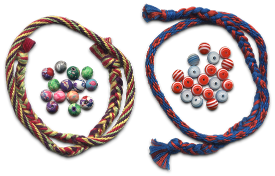 Kumihimo and beads
Here are some examples of real-world objects that were used in the design:
- my gift ribbon was a header;
- the menu is a sheet torn out of my notebook (which was originally in the box);
- Header in front of the content of the page is an element of the cover for the e-book reader;
- pop-up window and footer patch - an element of a denim backpack;
- Button to close the pop-up window - a button with a short;
- logo on the main page - freehand drawing;
- All the baubles and many beads that can be seen in front of the footer and on the page on the right also came from the real world (some of the baubles were woven during the development of the project).
 Home page
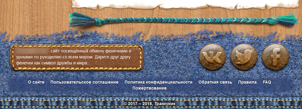 Footer
More screenshots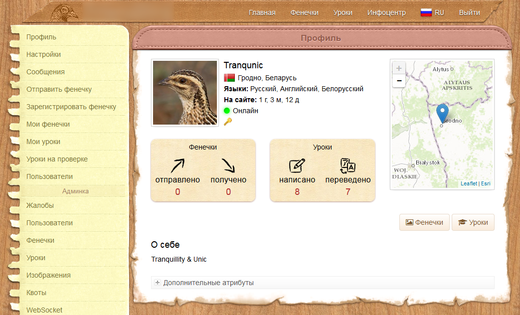 User profile page
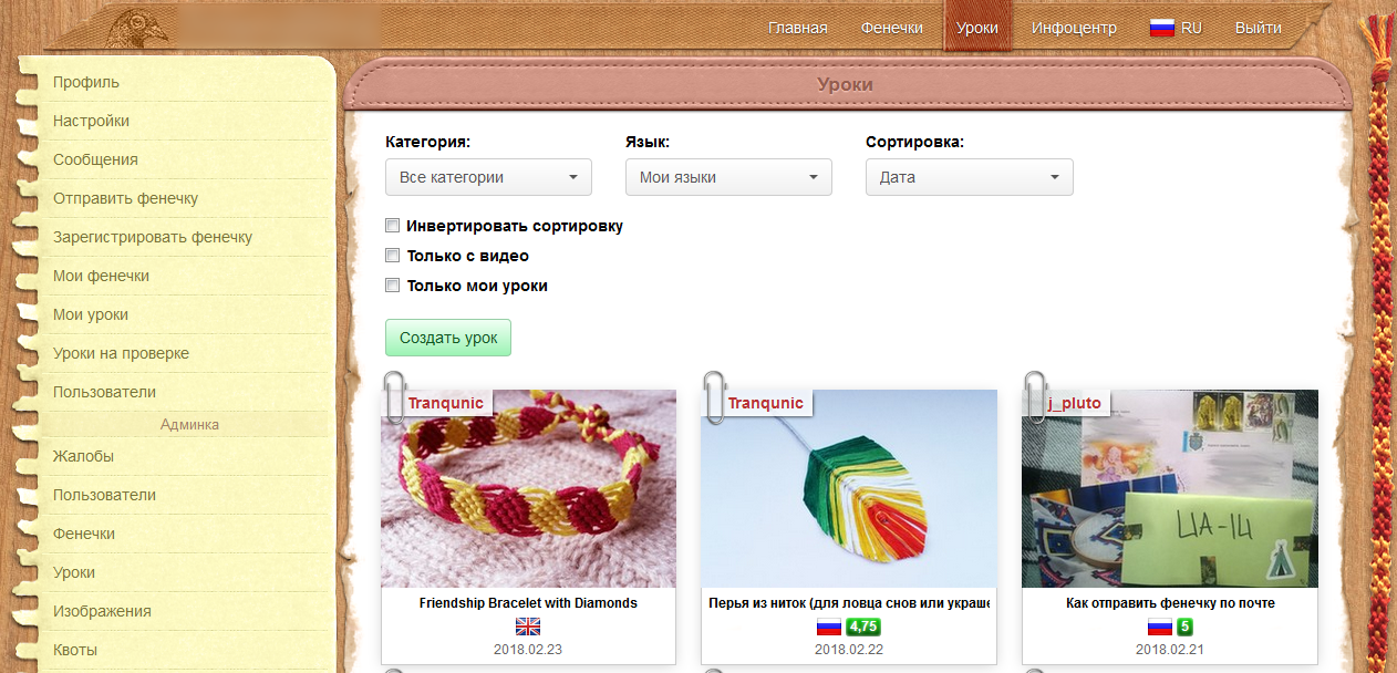 Lesson List Page
 Pop-up window with language selection
 One of the most time consuming work was the preparation of images for use in conjunction with the CSS attribute border-image. The whole difficulty was that certain parts of the picture should look seamless when repeated. It's like drawing repetitive (seamless) textures, only harder. Most of the time was spent on the picture used in the design of pop-up windows (and on the footer patch), since the size of the elements on which this picture “stretched” could freely change both vertically and horizontally.
Probably, with the design, we were confused more than with anything else. Moreover, they were so confused that many elements of the environment (for example, beads and beads) and some icons were modeled and rendered in Blender (something was even textured in Substance Painter). Yes, for the sake of icons measuring 32x32 pixels, we were so confused.
 Rendering results
How to create design elements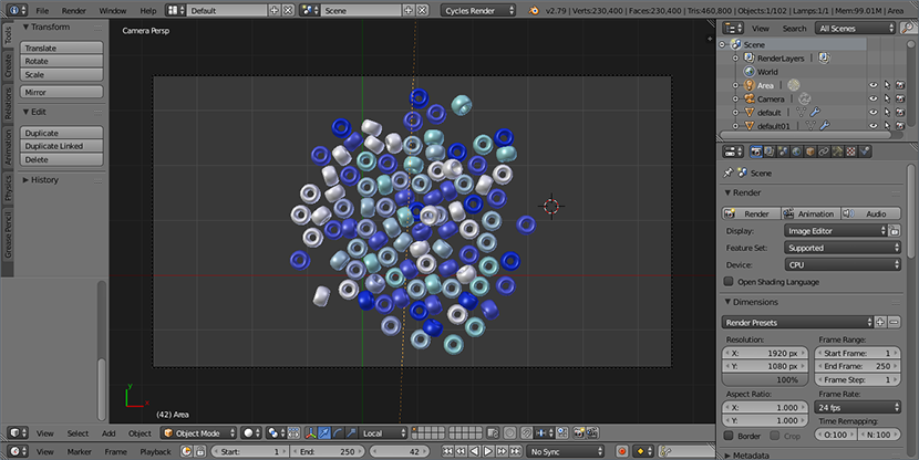 Bead modeling (used as an element of the environment)
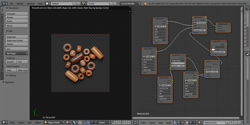 Modeling beads (used as an element of the environment)
 Button modeling (used as an element of the environment)
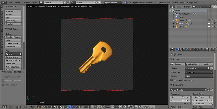 Modeling the key (used as the "Administrator" icon)
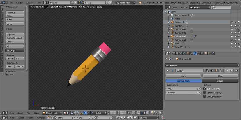 Pencil modeling (used as icon “Edit lesson” on the button)
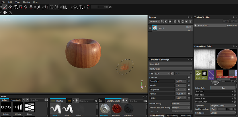 Texturing Beads in a Substance Painter
 , . , . JIRA , , . , . , . , , .
 267 -
267 -, () , Bootstrap, . , , . , .
, , — , — , , . , , -
. — , .
«fenker» («»), . , , -. : Fenkexchange, Friendship Pigeon, Flossy Hearts, Silky Hearts,…. , . ( ) (: -). - — FriendBird.
VDS, Debian Linux VirtualBox, . Linux ( ) , , « », Windows ( - 2D 3D ); - Apache Linux . , Linux - , , . , .
Linux, , — . , , , . , -, , , , . — , , - - Linux. , Windows , . , .
: MariaDB. URL' . MariaDB , MySQL Oracle, . , MySQL Oracle.
. , . - , , . , , -.
SSL-. , , , . ( Let's Encrypt) . , , Tomcat'. , , , . , , - ( fullchain- ( private key) pkcs12, JKS (Java Key Store), Tomcat'). , , , .
, «» — , . , , « », , .
- Linux , VDS, - , . , , . , , - . - , . , , .
25 2018 , , . , -. .
- , , , . — . ; , . , , .
. , - , , . , , .
:
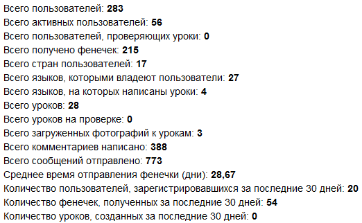
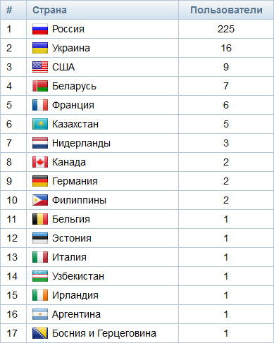
, , , . , . ( 2018.01.25 2018.07.03 ) 29 . , , .
, - . , . . , . .
, . , , ( , , ). , , , . , , , (, , , ). , - .
The present
5 1.5 , :
 2018.07.05
, , ; , , . , , , .
, , , , . , - ( ); ( ) ( , VDS ). , , , .
(, CDN ), , . , , . , - , , ; .