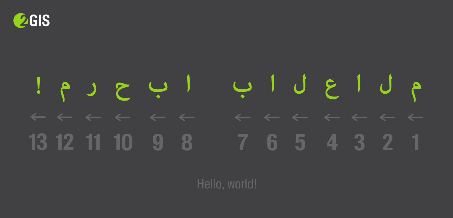
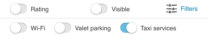
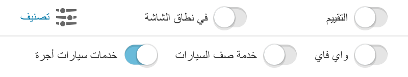
We recently translated the online version of 2GIS into Arabic, and in the last article I talked about the theory needed for this - what dir="rtl" , how the text displays a mixed focus, and how to control yourself.
It is time to start the practice - turn the interface from right to left with minimal effort, so that even a real Arab will not feel the trick.
In this article I will tell you how to quickly make a prototype, what to do with CSS assembly and what crutches to expand in JS, I’ll note a little about translation and localization features, remind you about the logical properties of CSS and touch on the RTL topic in CSS-in-JS.
Turn over styles
When I applied the dir = "rtl" attribute to the tag, only the implicit order of elements was changed - for example, the order of table cells or flex elements. Nothing happened to the values explicitly set in the styles.
Take the styles of some notification, located on the bottom right:
.tooltip { position: 'absolute'; bottom: 10px; right: 10px; }
dir="rtl" will not affect these styles in any way - in the RTL version the tooltip will also be on the right, although it is expected to be on the left.
What to do? It is necessary to replace right: 10px with left: 10px . And so with all the other styles. Absolute positioning, margin / padding, text alignment - everything is necessary for the Arabic version to turn in the other direction.
Fast prototype
For a start, you can, without thinking, change all occurrences of left to right and slightly conjure with shorthand values:
- left: 0 → right: 0
- padding-left: 4px → padding-right: 4px
- margin: 0 16px 0 0 → margin: 0 0 0 16px
For this, the postcss-rtl plugin is suitable. Convenient - you just need to throw it into the list of all postcss plugins of the project. It replaces all directed rules with mirrored ones and wraps it in [dir="rtl"] . For example:
.foo { color: red; margin-left: 16px; } [dir] .foo { color: red; } [dir="ltr"] .foo { margin-left: 16px; } [dir="rtl"] .foo { margin-right: 16px; }
After that, you only need to set dir="rtl" and automatically only the necessary rules will be applied. Everything works and it seems that almost everything is ready for production, but this solution is only suitable for a quick prototype:
- increases the specificity of each rule . This will not necessarily be a problem, but I would like to avoid it;
- such manipulations generate bugs . For example, the order of properties may break ;
- The size of the css-file grows significantly .
[dir] added to each selector, each directed property is duplicated. In our case, the size increased on one project by 21%, on the other - by 35%:
| original size (gzip) | bidirectional size (gzip) | swollen on |
|---|
| 2gis.ru | 272.3 kB | 329.7 kB | 21% |
| m.2gis.ru | 24.5 kB | 33.2 kB | 35% |
| habr.com | 33.1 kB | 41.4 kB | 25% |
Is there a better option?
Need to collect styles for LTR and RTL separately. Then it will not be necessary to touch the selectors and the size of the css will not change much.
For this, I chose:
- RTLCSS is the library under the hood for postcss-rtl.
- webpack-rtl-plugin is a turnkey solution for styles collected through ExtractTextPlugin. The same RTLCSS under the hood.
And he began to collect RTL and LTR in different files - styles.css and styles.rtl.css . The only disadvantage of assembling into different files is that you cannot replace dir on the fly without loading the pre-necessary file.
RTLCSS allows you to use directives to control the processing of specific rules, for example:
.foo { right: 0; } .bar { font-size:16px; }
What other solutions are there?
All existing solutions are almost indistinguishable from RTLCSS.
- css-flip from Twitter;
- Wikimedia cssjanus ;
- Yes, and postcss-rtl supports the parameter
onlyDirection , with which you can collect styles for only one directionality, but the size still grows - for example, for mobile 2GIS it is 18% instead of 35% (24.5 kB → 29 kB).
When are directives needed?
When styles should not be directional
For example, the angle of rotation of the arrow indicating the wind direction:
.arrow._nw { transform: rotate(135deg); }
Or fade by phone number - numbers are always written from left to right, which means that the gradient should always be on the right:


When you need to center the icon
This is a special case of the previous paragraph. If we center an asymmetrical icon through the indents / positioning, we shift its block to the side, and if this offset is reflected, the icon will “move” to the other side:
It is better in such situations to center the icon in the svg itself:
When you need to isolate a whole widget that should not respond to RTL
In our case, this is a map. We wrap all its styles when assembling into block directives: /*rtl:begin:ignore*/ ... /*rtl:end:ignore*/ .
Is there an even better option?
Turning over the rules works great, but the question arises - is it a crutch? The dependence of styles on direction is a natural task for the modern web, and its relevance is growing every year. This should have been reflected in modern standards and approaches. And found!
Logical properties
To adapt the layout for different directions, there is a standard of logical properties in css . It concerns not only the directions from left to right and right to left, but also the direction from top to bottom, but we will not consider it.
We already use something similar in flexs and grids - for example, flex-start , flex-end , grid-row-start , grid-column-end untied from "left / right".
Instead of the concepts left , right , top and bottom proposed to use inline-start , inline-end , block-start and block-end . Instead of width and height , inline-size and block-size . And instead of short-ends abcd - logical adcb (logical short-ends go counterclockwise). Also for existing shorthands, new paired versions appear - padding-block , margin-inline , border-color-inline , etc.
left: 0 → inset-inline-start: 0padding-left: 4px → padding-inline-start: 4pxmargin: 0 16px 0 0 → margin: logical 0 0 0 16pxpadding-top: 8px; padding-bottom: 16px → padding-block: 8px 16pxmargin-left: 4px; margin-right: 8px → margin-inline: 4px 8pxtext-align: right → text-align: end
And there is a long-awaited shorthand for positioning:
left: 4px; right: 8px → inset-inline: 4px 8pxtop: 8px; bottom: 16px → inset-block: 8px 16pxtop: 0; right: 2px; bottom: 2px; left: 0 → inset: logical 0 0 2px 2px
This is already available in flagless firefox and in flag flag webkit browsers.
Pros - the solution is native, it will work without any build / plug-ins, if the necessary browsers are supported. There is no need for directives - just write left instead of inline-start , when you mean the physical "left".
The disadvantages stem from the pluses - without plug-ins, the code in most browsers is invalid, you need to do a lot of work to translate a large existing project.
How to connect?
The easiest way is postcss-logical . Without the dir parameter, styles are collected for both directions in the same way as postcss-rtl, with the specified dir parameter only for the specified directionality:
.banner { color: #222222; inset: logical 0 5px 10px; padding-inline: 20px 40px; resize: block; transition: color 200ms; } .banner { color: #222222; top: 0; left: 5px; bottom: 10px; right: 5px; &:dir(ltr) { padding-left: 20px; padding-right: 40px; } &:dir(rtl) { padding-right: 20px; padding-left: 40px; } resize: vertical; transition: color 200ms; } .banner { color: #222222; top: 0; left: 5px; bottom: 10px; right: 5px; padding-left: 20px; padding-right: 40px; resize: vertical; transition: color 200ms; }
How to convince the team to start writing offset-inline-start instead of left?
No But in our project we decided to simplify - to write start: 0 instead of offset-inline-start: 0 , as soon as everyone gets used, I will start to impose a valid entry :)
RTL + CSS-in-JS = ️️ <3
CSS-in-JS does not need to be collected in advance. It means that it is possible to determine the direction of the components in runtime and choose which ones to turn and which not. Useful if you need to insert some widget that does not support RTL at all.
In general, the task is to convert { paddingInlineStart: '4px' } objects (or { paddingLeft: '4px' } if it was not possible to switch to logical properties) into { paddingRight: '4px' } objects:
- Armed with bidi-css-js or rtl-css-js . They provide a function that takes an object of styles and returns the transformed one to the desired direction.
- ???
- PROFIT!
React example
Wrap each styled component in a HOC that accepts styles:
export default withStyles(styles)(Button);
It takes from the context the orientation of the component and selects the final styles:
function withStyles(styles) { const { ltrStyles, rtlStyles } = bidi(styles); return function WithStyles(WrappedComponent) { ... render() { return <WrappedComponent {...this.props} styles={this.context.dir === 'rtl' ? rtlStyles : ltrStyles} />; }; }; ... }; }
And the orientation into the context is passed through by the provider:
<DirectionProvider dir="rtl"> ... <Button /> ...
A similar approach is to use airbnb: https://github.com/airbnb/react-with-styles-interface-aphrodite#built-in-rtl-support , if aphrodite is already used on the project, you can use this ready-made solution.
For JSS, it's still easier - you just need to connect jss-rtl :
jss.use(rtl());
styled-components
const Button = styled.button` background: #222; margin-left: 12px; `;
What if we work with patterned strings, not objects? Everything is difficult, but there is a solution - to calculate the name of the property from the direction specified in props :
const marginStart = props => props.theme.dir === "rtl" ? "margin-left" : "margin-right"; const Button = styled.button` background: #222; ${marginStart}: 12px; `;
But it seems easier to switch from lines to objects; styled-components can do this from version 3.3.0 .
Translation and localization features
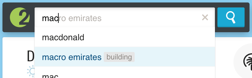
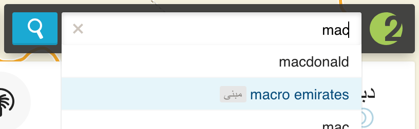
We have dealt with the technical part. They isolated the content of indefinite orientation, mirrored styles, placed exceptions in the right places, translated texts into Arabic. It seems that everything is ready - when you switch the language, the whole interface is on the other side of the screen, no layout does not go and everything looks better than on any Arabic website.
We show this Arab, and ...
It turns out that not every Arabic speaker knows what Twitter is. This applies to almost all words in English. For such a case, there is an Arabic translit: "تويتر".
It turns out that in Arabic, their commas, and the fact that we everywhere on the code concatenated through "," in Arabic must be concatenated through "،".
It turns out that in some Muslim countries the official calendar is Islamic. He is lunar and the usual translation formula is indispensable.
It turns out that in Dubai there is no negative temperature and the plus sign in the forecast “+40” does not make any sense.
Don't just take and mirror the styles.
If we do dir="auto" on the block element and its content will be LTR, the text will stick to the left side of the container, even if around RTL. This can simply be cured by explicitly setting text-align: right . You can even apply this to the entire page in the Arabic version - the value of this property is inherited.
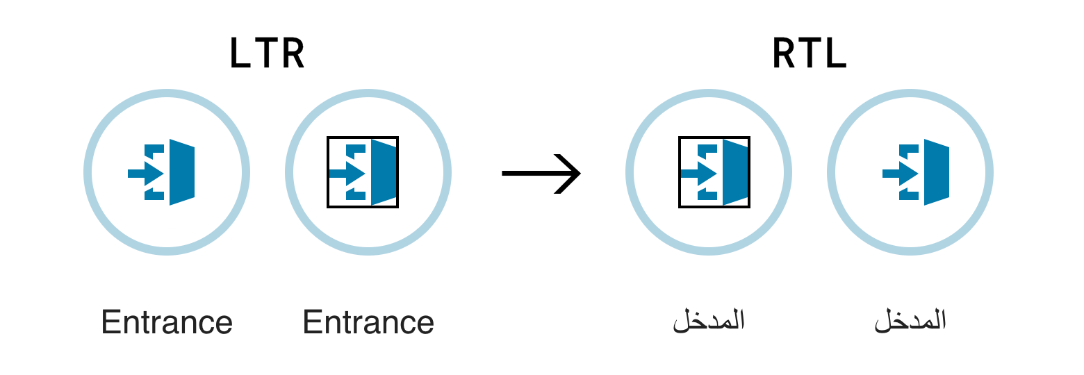
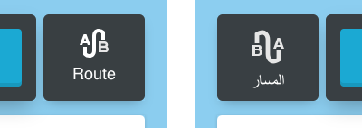
Icons also will not automatically be mirrored. And without this, directional icons, such as arrows in a gallery, can look in the wrong direction. Imagine, this is the only case in which the arrows made across the border paid off!
To reflect the icons, a simple transformation will help:
[dir="rtl"] .my-icon { transform: scaleX(-1); }
True, it does not help if the icon contains letters or numbers. Then you have to make two different icons and insert them conditionally:
And it turns out that not all interface elements need to be mirrored. For example, in our case, we decided to leave the checkboxes normal:
I don’t know how to select such elements from the entire interface. Here only a native speaker can help, who will say what is familiar and what is not.
User input
Even if we completely control all the data in our application, it can be user input. For example, the name of the file. You can even contrive and give out a .js file for .png, - such a vulnerability was in Telegram :
cool picture * U + 202E * gnp.js → cool picture * j.png
In such cases, it is worth filtering out of place utf-characters from the string.
Turn over scripts
In RTL javascript, the syntax changes a bit. A cycle that looked like this:
for (let i = 0; i < arr.length; i++) {
Now you need to write like this:
for (++i; length.arr > i; let 0 = i) {
Joke.
All that needs to be done is to avoid the concepts of “left” and “right” in the code. For example, we ran into problems in calculating the coordinates of the center of the screen - before all the cards were hanging on the left and now on the right, but the application code did not know about it. All calculations and inline styles should be carried out, taking into account the basic orientation.
Smarty
In some situations it is difficult to implement RTL support in some component of the system. Then you need to try to adapt this component under RTL outside, but leave the LTR inside.
For example, we have a slider. It supports only positive ordered values. It can be linear and logarithmic (at the beginning the density of values is less than at the end). It is necessary to reflect it with the preservation of the behavior of the scale.
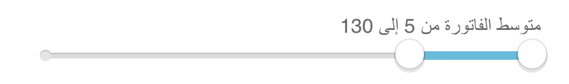
You can mirror the slider using transform: scaleX(-1) . Then you have to invert the work with the mouse (clicks and dredges) relative to the center of the slider. Bad option.
There is another option - to expand the axis in the other direction, changing only the transfer and receiving values from the slider. If this is a linear scale, instead of a set of values [10, 100, 1000], we transfer the set [N-1000, N-100, N-10], and in the handler we convert it back. For the logarithmic scale, instead of dialing [10, 100, 1000], we give [1/1000, 1/100, 1/10]:
function flipSliderValues(values, scale, isRtl) { if (!isRtl) { return values; } if (scale === 'log') {
That's how the slider began to support RTL, although he does not know about it.
Storybook
In contrast to the checking of layout for some IE9, to check the layout for RTL you do not need to launch a separate browser. You can even typeset and see the layout of LTR and RTL simultaneously in the same window. For this, you can, for example, make a decorator in a historical book , which renders two versions of the story at once:
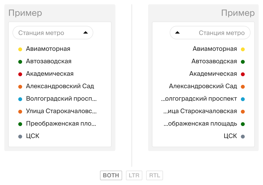
The screenshot shows that without text-overflow: ellipsis isolation text-overflow: ellipsis behaves differently than we would like - it’s better to fix right away.
It is much easier to support RTL at once with the layout, than to test absolutely the whole project later.
Unsolved problems
Knowledge of the theory does not help solve absolutely all problems. I will give one example.
A tool tip appearing in the text direction as you type. When we talk about multilingual input, we cannot know in advance which side should display this hint:
We must try to avoid such problems at the design stage and sometimes abandon the obvious solutions for LTR that are not applicable in RTL. In this case, when navigating through prompts, you can substitute the entire text (as, for example, Yandex or Google does).
findings
RTL is not just “flip everything”
It is necessary to take into account the peculiarities of the language; something does not need to be turned over; Somewhere in logic, absolutely need to abandon the "right" / "left."
It is very difficult to do something without knowing the language
You will think that everything is ready until you show your project to a real native speaker. Develop from the perspective of a person who does not know any language. After all, even such obvious words for you, such as, for example, Twitter, may have to be translated. And punctuation marks, it turns out, are not the same on the entire planet.
The final recipe
It is difficult to describe in one list everything that was discussed in two articles. Walkthrough will not be, but the main thing that needs to be done:
- Be sure to find a native speaker and show him the prototypes as early as possible;
- Collect styles for LTR and RTL in different files. Rtlcss and webpack-rtl-plugin;
- add exceptions for everything that is not necessary to turn over and explicitly reflect what did not turn up itself;
- isolate all arbitrary content with
<bdi> and dir="auto" ; - explicitly set
text-align to the whole page; - avoid
left / right in js code when you mean the beginning and the end.
Prepare to spend the most time on the smallest details.
Being ready in advance is not difficult
And some tips for those who so far are not going to adapt the site for RTL, but want to spread straw:
- Do not use the
direction property for other purposes; - just in case, still isolate all arbitrary content (and indeed even in the English interface, users can write something in Arabic and break everything);
- if possible, use logical css-properties ;
- check the layout not only in different browsers, but sometimes in RTL, if only for the sake of curiosity. Better yet , unobtrusively control the layout for RTL with tools like a storybook ;
- Do not allow hardcode language constructs (for example, string concatenation, separated by commas), if possible, configure everything, including punctuation marks. This is useful not only for RTL - for example, the question mark in Greek is “;”.
These rules should not be a hassle. But if the desire to launch the RTL version comes suddenly, it will be much cheaper than it could be.