In the last article I described the use of cohort analysis to find out the reasons for the dynamics of the client base. Today it's time to talk about the tricks of preparing data for cohort analysis.
It is easy to draw pictures, but in order for them to be considered and displayed correctly “under the hood”, a lot of work needs to be done. In this article we will talk about how to implement cohort analysis. I'll tell you about the implementation using Excel, and in another article using R.
Whether we like it or not, in fact Excel is a data analysis tool. More “arrogant" analysts will believe that this is a weak and not convenient tool. On the other hand, in fact, hundreds of thousands of people are doing data analysis in Excel, and in this regard, he will easily beat R / python. Of course, when we talk about advances analytics and machine learning, we will work on R / python. And I would be in favor of most analysts being made with these tools. But you have to admit the facts, the vast majority of companies process and submit data in Excel and it is this tool that ordinary analysts, managers and product owners use. In addition, Excel is hard to beat in terms of the simplicity and clarity of the process, since you make your calculations and models literally with your hands.
And so, how do we do a cohort analysis in Excel? In order to solve such problems you need to define 2 things:
What data we have at the beginning of the process
What our data should look like at the end of the process.
In order to collect a cohort analysis, we will not need only working data on dates and divisions. We need data at the individual customer level. At the beginning of the process we need:
Calendar date
Customer id
Customer Registration Date
Sales volume for this customer on this calendar date.
The first difficulty to be overcome is to obtain this data. If you have the right repository, then you should already have it. On the other hand, if, for the time being, only a record of data on aggregate sales by day has been realized, then you only have customer data on “sales”. For a cohort analysis, you will have to implement ETL and add client data to your storage, otherwise you will fail. And best of all if you divide the “prod” and analytics into different bases, because The analytical tasks and tasks of the functioning of your product have different goals for the competition for resources. Analysts need fast aggregates and calculations for many users, the product needs to quickly serve a specific user. I will write a separate article about the organization of the repository.
So, you have the starting data:

The first thing we need to do is convert them into “ladders”. To do this, you need to build a pivot table above this table, by rows - the registration date, by columns - a calendar date, as values - the number of clients' id. If you have correctly extracted the data, then you should get this triangle / ladder:
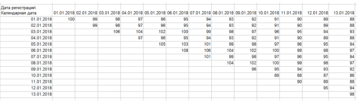
In general, the ladder is our cohort graph, in which each row displays the dynamics of a separate cohort. Clients in time in this display move only within one line. Thus, the dynamics of the cohort reflects the development of relations with a group of clients who came in one period of time. Often, for convenience and without loss of quality, cohorts can be combined into “blocks” of rows. For example, you can group them by week and month. In the same way, you can group a column because Perhaps your product development rate does not require detailing up to days.
Based on this ladder, you can build a graph from my article (I really pointed out that I grouped several lines into one, so that the cohorts were smaller):
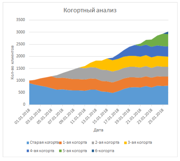
This is a graph with cumulative areas, where each row is a line, horizontally across dates.
Slightly more complicated is the logic for implementing the “flow” chart. For threads, we need to do some additional calculations. In the thread logic, each client arrives in different states:
- New - any client who has the difference between the date of registration and the calendar date <7 days
- Reactivated - any customer who is no longer new, but did not generate revenue in the last calendar month.
- Active - any customer who is not new, but in the calendar month generated revenue
- Gone - any customer who has not generated revenue for 2 months in a row
First, you should fix these definitions in the company so that you can correctly implement this logic and automatically calculate the states. These 4 definitions have far-reaching implications in general and for marketing. Your strategies for attracting, retaining, and returning will be based on what state you think the client is in. And if you begin to implement machine learning models in predicting customer care, definitions will be your cornerstone of the success of these models. In general, about the organization of work and the importance of analytical methodology, I will write a separate article. Above, I gave just an example of what these definitions might be.
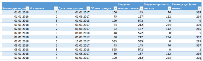
In Excel, you need to create an additional column where to enter the logic described above. In our case, we will have to "sweat." We have 2 types of criteria:
- The difference between the date of registration and calendar date - each line has this data and then you just need to count it (subtracting dates in Excel just makes the difference in days)
- Data on revenue in the current and last month. This data is not available to us in the line. Moreover, given the fact that our table does not guarantee order, you cannot say exactly where your data is on other days of the month for this client.
To solve the problem of 2 types of criteria can be 2 ways:
- Ask to do this in the database. SQL allows using the analytic function to calculate for each client the amount of revenue for the current and last month (for the current month SUM (revenue) OVER (PARTITION BY client_id, calendar_month, and then LAG to get the offset for the last month):
- In Excel you have to implement it like this:
- For the current month: SUMMESLI (), the criteria will be the client id and the month of the calendar day cell
- For the last month: SUMMESLI (), the criteria will be the client id and the month of the cell of the calendar day minus exactly 1 calendar month. In this case, I will note that you must deduct the calendar month, and not 30 days. Otherwise, you risk getting a blurred picture because of the uneven number of days in months. Also use the ERROR function to replace erroneous values for customers who did not have the previous month.
By adding the revenue columns of the current month, last month, you can build an embedded IF condition that takes into account all factors (the difference of dates and the amount of revenue in the current / last month):
IF (date difference <7; “new”;
IF (AND (last month's revenue = 0; current month's revenue> 0); “reactivation”;
IF (AND (last month's revenue> 0; current month's revenue> 0); “current”
IF (AND (last month's revenue = 0; current month's revenue = 0); “gone”; “error”))))
“Error” is needed here only to control that you were not mistaken in the record. The logic of the MECE state criteria ( https://en.wikipedia.org/wiki/MECE_principle ), i.e. If everything is done correctly, then one of 4 of them will be stamped
You should be able to do this:
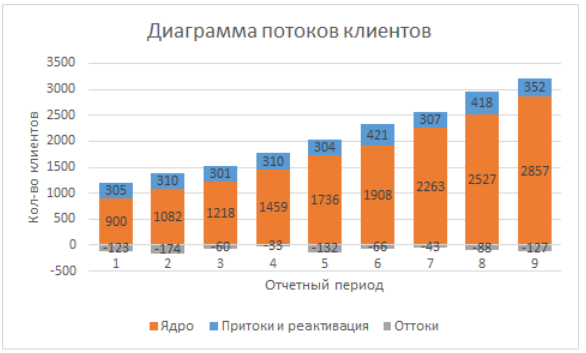
Now this table can be rebuilt using the pivot table into a table for plotting. You need to transform it into a table:
Calendar date (columns)
State (line)
Number of clients id (values in cells)
Then we just have to build a bar chart with accumulations based on the data, on the X axis the calendar date, the rows are states, the number of clients is the height of the columns. You can change the order of states on the graph by changing the order of the rows in the “select data” menu. As a result, we get the following picture:
Now we can proceed to the interpretation and analysis.