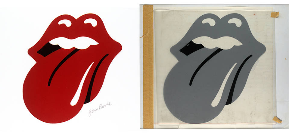
 Source of Tongue and lips logo
Have you ever caught yourself thinking that, passing by a gas station or passing by a shelf in a store, it is sometimes enough to see a familiar logo, to make your choice? I think that you will agree with me that the situation described is, in general, fairly everyday. After all, when choosing a product or service, people, as you know, do not always focus only on their rationality - we are all subject to emotions, and a logo, like a brand design, creates certain emotions and, as a result, associations. The logo is an important part of creating the image of the company. As David Ogilvy, the “father of advertising,” said: “
Why do some people choose Jack Daniel's and others choose Grand dad or Taylor?” Have they tried all three varieties and compared the taste? Do not make me laugh. In fact, all these three varieties have three different images that affect different segments of the consumer audience. People choose not whiskey, they choose the image . ”
Perhaps some will argue that the image is created by marketing and advertising, to which the above quote refers. But, it seems to me, the effect of advertising is only stronger if the brand logo carries the message that the company seeks to convey to its customers - then it becomes not just an emblem, but begins to personify the spirit of the corporation and becomes an integral part of its image.
I will try to explain my thought with an example, at first glance, not obvious. But this story clearly shows how a well-chosen logo from just a picture becomes a legend that thousands of people around the world, both old and young, are ready to wear on their summer T-shirts and stick to cars and laptops - in general, they demonstrate their belonging to “pagan »Cult. And this story is ready to serve as an example for those who are in search of a logo for their brand.
... it all started on a rainy English summer day in 1970, when a young man with full lips acquired from a junkman a picture of the multi-hand Indian goddess Kali with a blood-red tongue sticking out. A few days later, this young man, who turned out to be none other than the vocalist of the already thundering rock band The Rolling Stones Mick Jagger, was scheduled to meet with a student at London's Royal College of Art, John Pasha, at which they were to discuss creating a logo for the group. According to the stories of Pasha, his customer was impressed by the image of the Indian goddess of destruction, the protruding tongue of which symbolized what in Hinduism is called the “modes of rajis” - a combination of such qualities as passion and activity. And it is this language that allegedly became the prototype of the logo that everyone knows now, probably.
 Source of Goddess Kali.
Most likely, this story really took place, and it was this image that impressed Erudite Jagger, who, according to the designer, always showed interest in graphics and photography, and after Pasha himself. But one thing - that suggested an idea, and another - what was the meaning of the logo itself. And “counting” the premise of a famous language is not difficult, if we take into account the context in which it was created.
The Rolling Stones positioned themselves as the opposite of The Beatles. While the Liverpool Four conquered the audience with their sincerity and light lyrical love songs, Jagger and his team went all out and out. They were called “the bad guys of rock and roll”: for sexually aggressive songs, images and lifestyles. Such musicians needed a corresponding symbol that would become their brand name. And the sticking out playful language had to emphasize precisely this rebellious component of the group's creativity.
I managed to communicate in correspondence with Mr. Pasha. He now lives in Oxshott, Surrey, South England. This spring he turned 73 years old. He quickly responded to my offer to talk, the same day, and patiently answered questions, many of which he had been asked more than once. During his life, he managed to collaborate with several world stars, creating posters for them - the well-known The Who, Paul McCartney and Jimmy Hendrix are on the list of his clients.
 Source of Young john
John acknowledges that the logo should have become a symbol of rebellion, but at the same time emphasize the individuality of the leader of the group: “the
logo echoed Mick’s famous [puffy] lips, and this was something sexy .” And Pasha coped with his task one hundred percent. His logo has become an absolute hit "to the point." The language of "rolling" has become one of the iconic symbols of the popular culture of the last century. But even in the present century, in hot weather, it can be found several times a day - the tongue stuck out became the same popular print for T-shirts, like old Che - only the fashion for the Cuban revolutionary passed, and the “language” is still popular today.
 Source of John Pasha with his most famous creation.
What are the same tips John Pasha can share with logo designers for brands?
- The logo should be simple. Like an apple from Apple or a bird from Twitter. “ I tried to simplify the design as much as possible. The idea was this: create a symbol for a group that can exist by itself . ”
- The consequence of the first point is that the message of the logo should be clear: " The growing popularity of the logo may be related to the fact that this is a simple but strong message that is able to establish a connection between different people, both young and old ."
- The logo should be such that it can be easily reproduced: “ Its [group logo] almost cartoon character allows it to be reproduced and adapted in different ways .” As an example, various variations of the The Rolling Stones logo, which the group produces almost every couple of years. For example, a simply gorgeous gorilla placed on the cover of an anniversary collection of the best hits of the group for 50 years exposes the same language that the predatory fangs received in addition. The cover was created by the American artist Walton Ford (Walton Ford), in fact, continuing the traditions of another American artist-naturalist John James Adyubon (John James Audubon), who worked in the early XIX century.
- John says that the logo created by him is also popular because during all this time - more than 35 years - it has only been updated once and only a few years ago. All the time before that, he remained unchanged.
 Source of
To get another expert opinion, I turned to designer Chris W. from the studio
BandLogoMaker . He echoed John Pasha and said: the main thing is that the logo should be simple. "
Many - I would say most - come with ideas and not original, and at the same time tricky ." Then Chris tries to convince his next client to simplify the design. “
If the customer comes with an open mind and is open to the world, the designer takes the process into his own hands: he begins to get acquainted with the group, listen to their music. You need to strain your ass and make an outstanding logo that the group itself would like . ”
 The poster for the American tour The Rolling Stones, one of the first appearances of the "language" as the official logo of the group.
It is interesting and consider the logo in terms of color. I am not a marketer and not an expert on color perception, but overall, I think red is associated with energy, excitement, and blood. On one
site they say that colors can cause physical sensations, and, they say, red color “sounds” louder than others. Well, if this is true, then this is the thing for a rock band.
So what is this story about? It is about the logo, which has become a completely independent symbol, a legend. About the logo, which got what is called “in the bull's eye” and became the personification of one of the most successful and long-lived brands in the music industry. About the logo, which is not ashamed to wear on your T-shirt. And even with your logo, they may not release a print for clothing, but it should become a worthy symbol of your company, which may play a significant role in brand recognition and customer attachment to it.
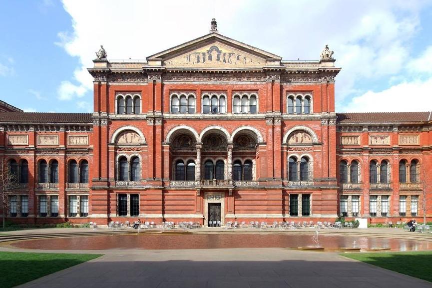 Victoria and Albert Museum, London. The original logo is stored there.
In conclusion, I would like to say that “Tongue and Lips” (the official name of the logo) is, perhaps, included in all ratings of the best logos in history. Several years ago, the original emblem was purchased by the London Victoria and Albert Museum, exactly for 50 thousand pounds sterling. Interestingly, back in 1971, for his work, called David Berry, director of the The Art Fund,
one of the most visually dynamic and innovative logos in history , John Pasha, a student at the Royal College of Art, won 50 pounds in the approximate transfer to today's money is about five hundred pounds. According to him, having received a fee, he first went and bought himself a cake with coffee. He saw Mick Jagger several times after that, then in Paris, then in Munich, "
and every time well past midnight ". He has no doubt that The Rolling Stones still do the coolest music shows on the planet.