
When working with data, it is important to understand how to present them to your target audience in a better and more efficient way. Not just to make graphs for graphs, to make it so that within a few seconds a person can understand what is depicted on the graph, what you want to say and what conclusion can be drawn from it.
There are many different tricks that make the visualization clear, concise and informative. But often the problem lies in ignoring even the most obvious formatting rules, so we want to devote this article to 8 basic ways to improve data visualization, which will increase the overall readability and understanding of your graphs and charts.
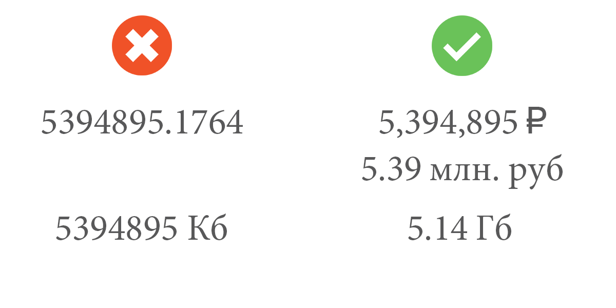
1. Format numeric data
Formatting numeric data is a quick and easy way to make data visually appealing and easier to read for the end user. In order to format the numeric data, you need to answer the following questions:
- How many decimal places do you really care about and make sense?
- Do units of measure suit you?
- What qualitative sense does this number carry, and can we additionally designate them with symbols? (For example, in the case of currency, traffic volume, etc.)
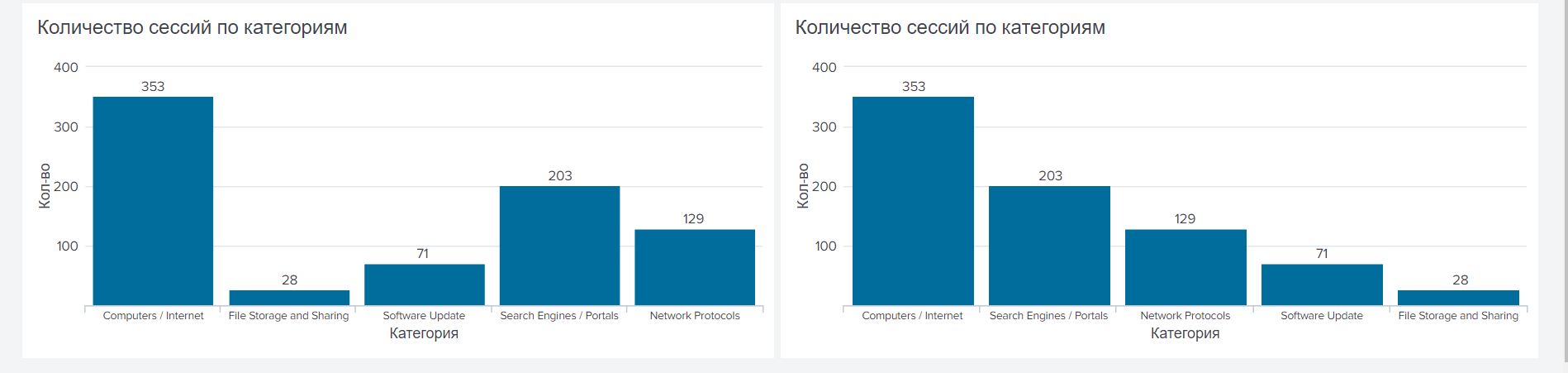
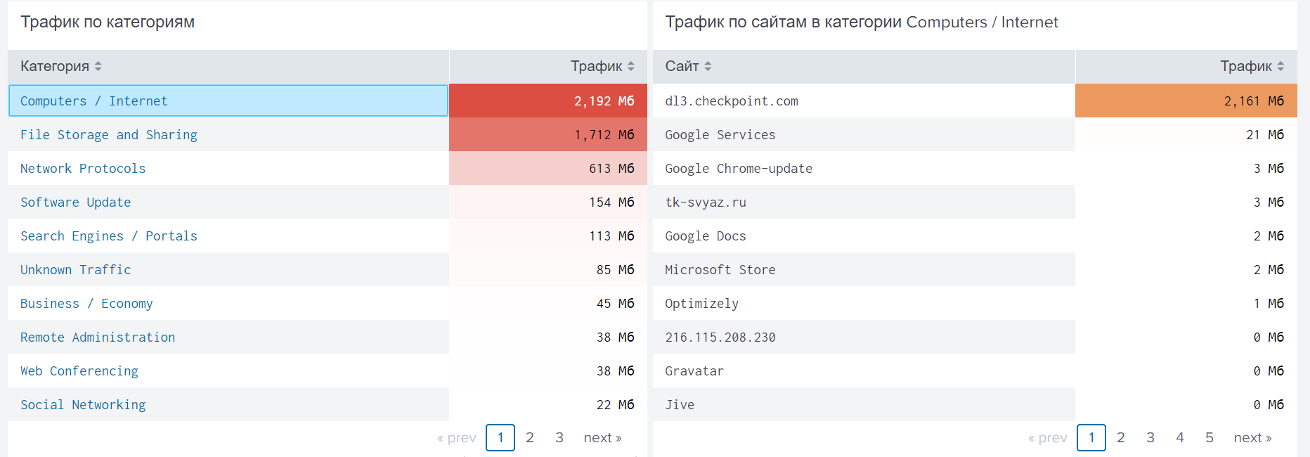
2. Sort
When your chart is not associated with a change in the indicator over time, you should sort the data in descending or increasing order. Sorting helps to quickly conclude about the leaders and outsiders on a particular indicator.
3. Use conditional formatting.
Conditional formatting gives you a quick visual signal about belonging to a particular group. For conditional formatting, you can set specific boundaries (list of values) by specifying a color (or indicator) for each value interval for each individual value.
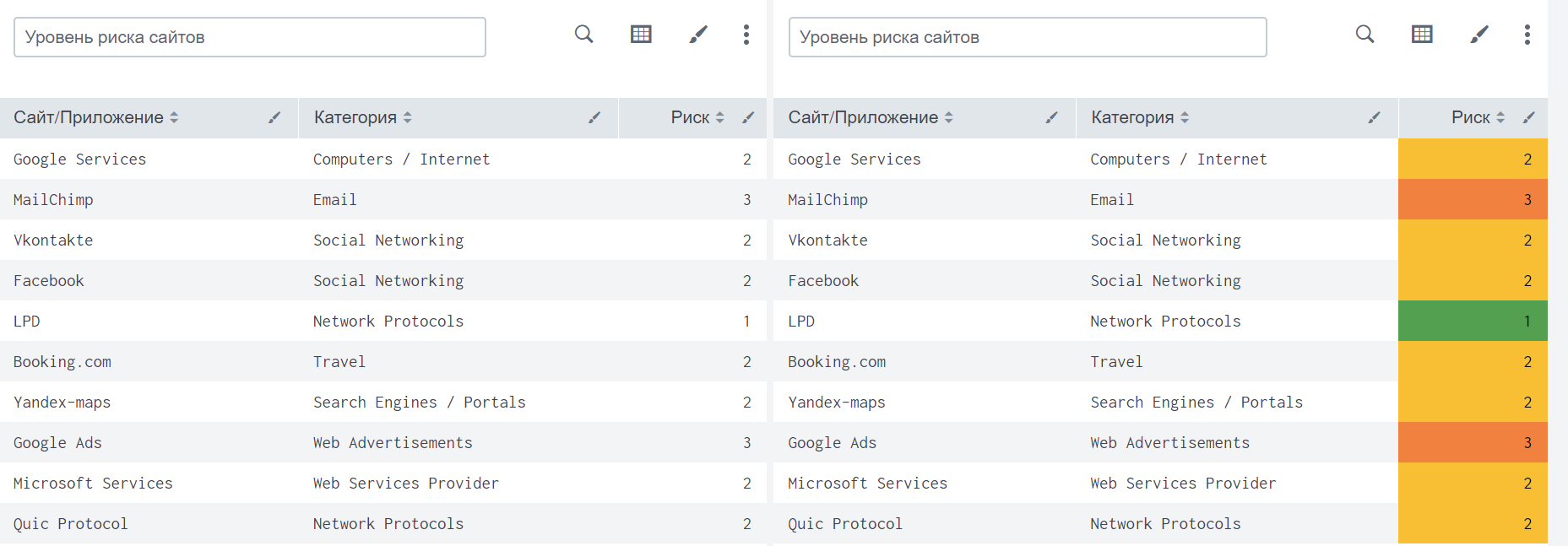
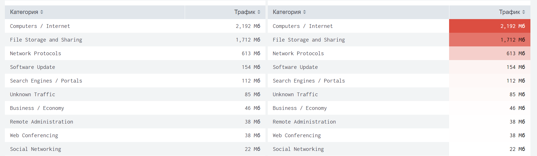
Also, using conditional formatting, you can highlight the nature of changes in indicators (decrease or increase).
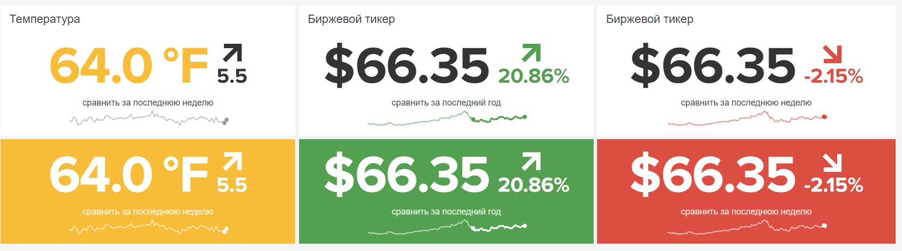
Use only green for positive dynamics and “positive” results, and only red for negative dynamics and “negative” results. Do not change their places, it can lead to a misunderstanding of your visualization by other people.
4. Make good names for diagrams.
The name of the diagram should be clear to the user, concise, but at the same time clearly describing what is shown in the diagram and what users should see. The names of the diagrams should be indicated, even if it seems to you that the image speaks for itself. Not necessarily what is clear to you will also be understood by others.
5. Check the field name
Pay attention to all the fields that are present in your diagrams (both in prominent places and in possible tooltips that appear when you hover / click). Diagrams should not contain draft or technical field names, which significantly reduces their readability and the possibility of quick understanding.
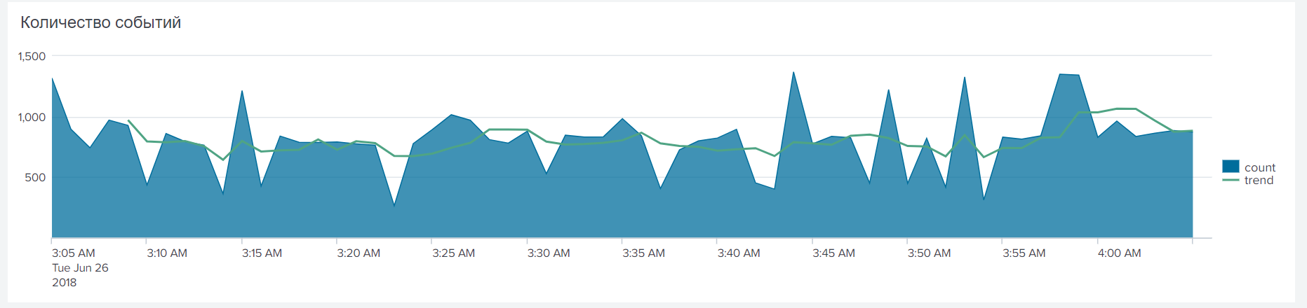
6. Add trend lines
Trendlines is a very simple, but powerful tool that helps you identify trends in datasets and determine thresholds for making decisions on deviations.
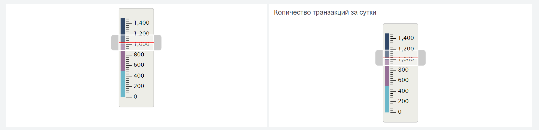
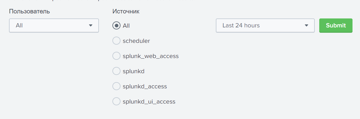
7. Add filters
Filtering allows you to quickly add or remove specific events from a chart. Filtering can be different: by key fields, by values, by time, etc.
8. Add hierarchy and drill down.
Adding a hierarchy to the visualization will allow you to view both the indicators as a whole and descend into the details if you have questions about the formation of values or other characteristics of the selected element.
All examples were illustrated using the
Splunk machine data analysis platform.
Conclusion
The above list is only a small part of the techniques that you should pay attention to when visualizing data. But even if you do not even forget about them, your diagrams will take on a new look.
If you are interested in this topic, then write comments, we will be happy to answer you. Subscribe to our
VK group and
Telegram channel if you want to keep abreast of new articles.