Hello!
In modern design, when creating websites and applications, many developers use the effect of depth and volume, often referring to such css properties as
box-shadow and
drop-shadow . Some believe that
in 2018 this is a trend. Indeed, there are many foreign and Russian sites, which in 2018 began to use shadows more often.
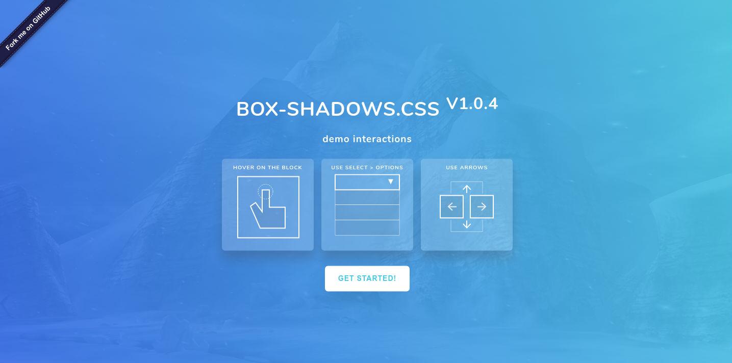
In this regard, a small
collection of simple and pleasant css shadows that are often found on websites (plus or minus a couple of pixels aside) has recently appeared. The collection is called
Box-shadows.css . She has already received some positive feedback online and has recently been updated to version 1.0.4, in which several more beautiful shadows appeared, divided into groups.
After the last update, the collection began to contain more than 60 current shadow options that are great for use in tables, for the contents of home pages, containers, navigation bar and other blocks of your site.
The main purpose of creating this collection is to facilitate the work of novice web designers and developers in creating a pleasant and modern design. Thanks to the collection, you can simplify work with blocks and reduce the time for selecting css shadows in the generator (which, by the way, is also available). Of course, experienced developers are unlikely to need it, but maybe they will get something interesting for themselves. The collection is useful to those who have not yet had time to fully delve into the layout, but wants to create beautiful shadows on the buttons, blocks and containers of their site.
Connecting styles
To connect the style sheet, go to
the project website and download the file you need. Then, connect the file to your html page, after the opening <head> tag in a convenient way for you.
<head> <link rel="stylesheet" href="/box-shadows.css"> <link rel="stylesheet" href="/box-shadows.min.css"> </head>
You can use
the min.css file
generator , which allows you to create your own file consisting only of the selected classes. Well, or just select the block you want and copy your favorite shadow to your site. This will help reduce the load if your project uses less than two or three shadows. Just follow the instructions on the site and you will succeed.
Using classes
To connect the desired shadow to your block, simply add the class
.bShadow with the desired number to it:
<div class="bShadow-54"></div>
Hover effects
To create a hover effect for your block, add the class you like with a number, for example
.bShadow-1 and write the Latin letter
h after the number. For example:
<div class="bShadow-38 bShadow-1h"></div>
Look
at the example of the class
.bShadow . When hovering, it assigns shadow values to the neighboring class
.bShadow-1 . If you want the shadow not to appear when you hover or click, add the class
.bSnoneSmooth Transformation and Animation
The
.bShadow class by default uses smooth animation in the .2s
transition: transform 0.2s ease-in-out , and also includes a property that warns the browser about the upcoming shadow transformation and the
will-change: transform, box-shadow; position
will-change: transform, box-shadow; .
Use this to make beautiful animation of your blocks. For example, you can add your class or properties with transformation:
.transform-translateY-5:hover { -webkit-transform: translateY(-5px) translateZ(0); transform: translateY(-5px) translateZ(0); }
Then add to the container you need:
<div class="bShadow transform-translateY-5 bShadow-1h"> </div> and you will see the
resultAdd inset parameter
To add an internal shadow parameter, simply paste the script into the html page and specify in it the classes for which you want to apply it.
For example
.bShadow-1 . To specify multiple classes, separate them with commas, as in the example below. Do not forget to put a dot in front of the class!
[].forEach.call(document.querySelectorAll('.bShadow-1, .bShadow-2h, .bShadow-3'), function(node) { var bsh = getComputedStyle(node).boxShadow; node.style.boxShadow = "inset " + bsh; });
DemoCss box-shadow generator
The collection also implies an increase in the number of classes with shadows created by the user. That is, you can use the
classic shadow generator to complement the collection with your own styles. By clicking the "Save and Add Next" button, you can create an infinite number of classes. The first generated and subsequent classes are assigned a sequence number that is not in the collection. The resulting styles can be easily copied and pasted into the root css file of your project or into the box-shadows.min.css file created on the collection site.
Now it is planned to expand the collection and configure the npm package, but there are some difficulties with this. Therefore, for now I hope to receive the
cdnjs link and further development of the project.
GitHub ·
WebPage