
Once we decided to see what seasonal interests 2GIS users have in different cities. Bursts of interest in colors, Christmas gifts and tires are quite expected. We decided not to limit them and go further, checking all areas of activity in all 113 cities of our presence.
In this article I will tell you how we looked for seasonality and what features of user behavior in them we discovered.
Why do we need to measure seasonality?
The needs of 2GIS users change throughout the year: consumer goods, services, construction, public services. Knowledge of seasonality is useful for several reasons:
- We are beginning to understand more about the values and interests of our users at the moment and in the near future.
- We can "predict" the user's request.
- Sales managers focus on areas of interest to users.
Types of traffic
Before we talk about how we handle traffic, it is worth clarifying that we divide it into several types.
Recovery - the type of traffic in which the user knows exactly the company he wants to contact. He needs to clarify the address, schedule, or find the entrance. In this case, the search is carried out by the company name, telephone number and other attributes of the company itself.
Discovery traffic is when a user formulates a request in more general terms: “upholstered furniture”, “food for Lenin”, “baths”. That is, the user explores options and market offers, often calling the organization or visiting their sites.
Geo-traffic occurs when the user is working with the map. For example, looking for the nearest pharmacy or service station.
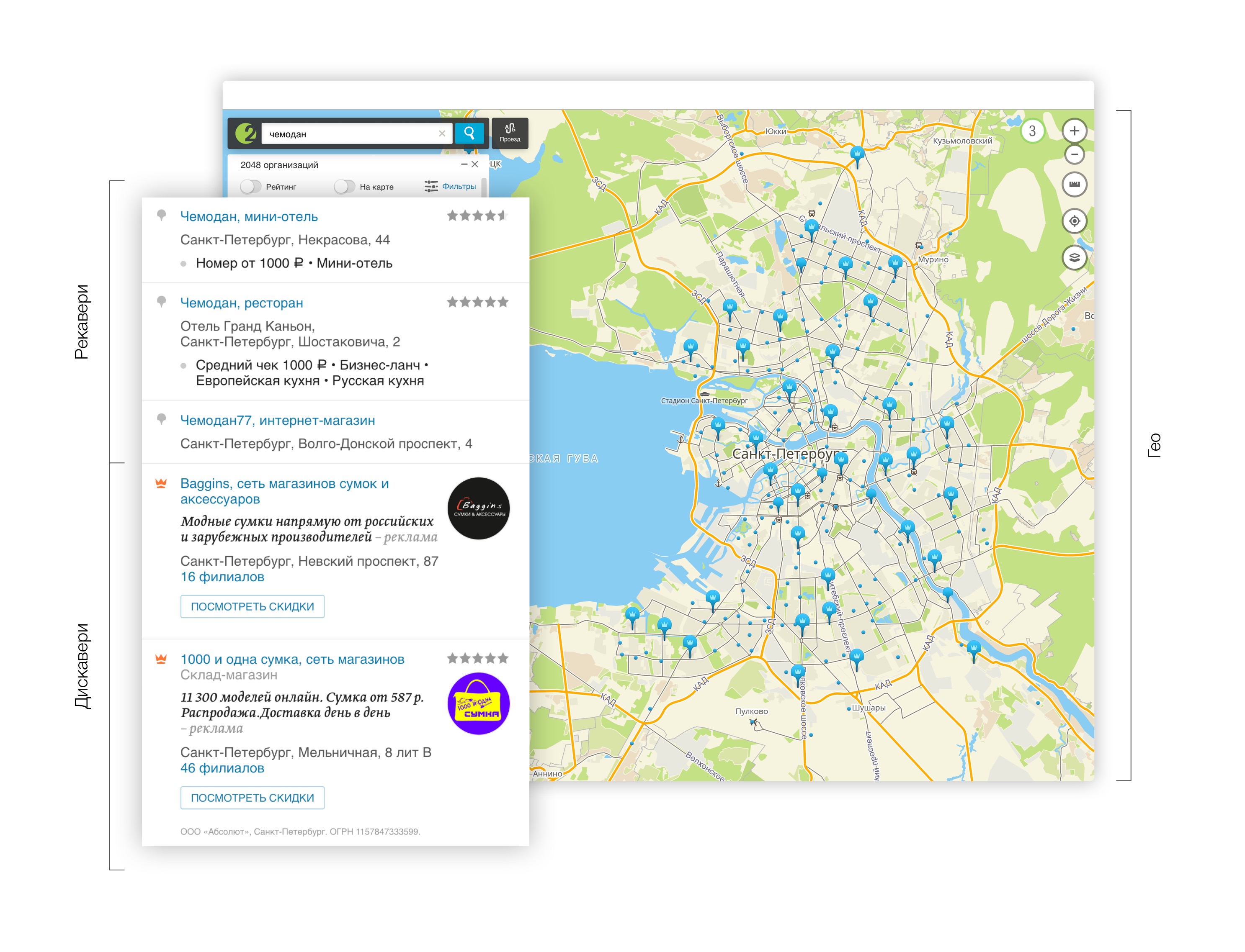
All user requests and all subsequent actions are tagged by traffic. Discovery + geo-traffic was taken for analysis of seasonality. Since, firstly, they correspond to the manifestation of user interests, and secondly, they can be managed. You can not manage the recovery traffic.
About trends
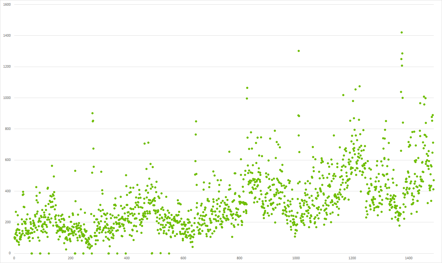 Chart 1: Do you see seasonality?
Before you start searching for seasonality, you need to take into account changes in the volume of traffic on different types of devices. We took into account that WinPhone and PC versions are constantly falling. Whereas online, Android, iOS - permanently grow.
Trend Hypothesis Testing
Criteria for determining seasonality are developed for stationary rows. We need to test the hypothesis that the series contains a trend. We will consider the time series as a random process. Then the elements of the series are realizations of some random variable.
We can test the hypothesis that all sample values belong to the same general population with the mean m. Then the main hypothesis is:
against competing trend hypothesis
$ inline $ H_1: ∣m_ {i + 1} −m_i∣> 0, i = 1,2, ..., N − 1 $ inline $
where N is the number of elements in the series.
In order to test the hypothesis, you need to use one of the criteria for the significance of the trend. On the basis of the conducted research, the
criterion of inversions was chosen.
If the hypothesis is not rejected, then it is necessary to remove the trend from the data. We assume that in our data there can be only a linear trend. Oh, he would be exponential! We will also assume that we can have no more than one inflection point.
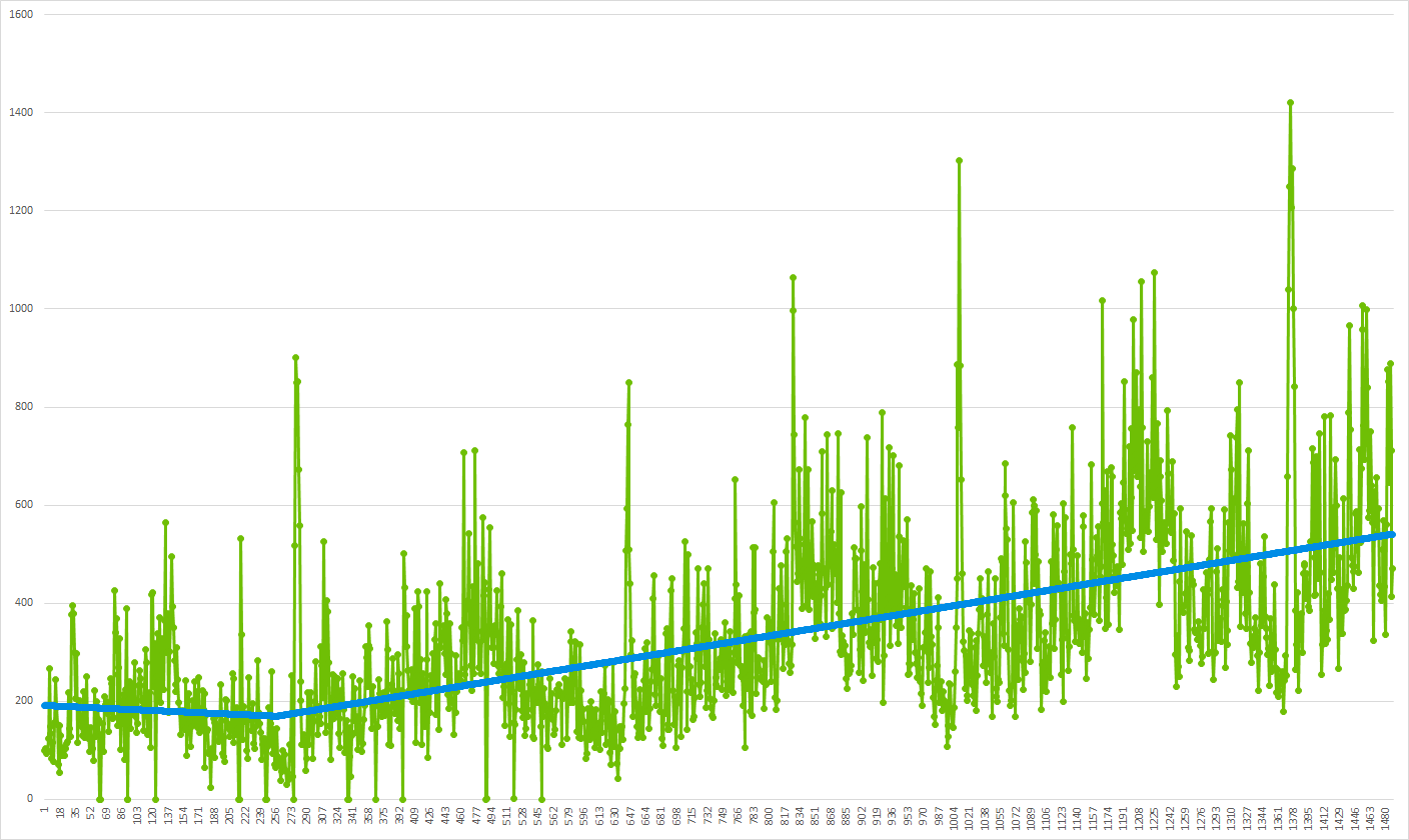 Chart 2: Time series (from chart 1) and its trend
About rakes and openings
We set the boundaries of the study and set about testing hypotheses. Of course, it was not without rakes and discoveries: since the task was not limited to popular services in million-plus cities, we collected a list of special cases that are worth paying attention to.
- Gaps in the data. In narrow spheres of activity on some dates there may be no data. Especially the case is relevant for small towns. This feature must be considered for the correct construction of the regression.
- In the case of detection of the inflection point - consider its proximity to the beginning or end of the series. Possible misinterpretation of the behavior of the series in the boundary conditions. For example, in graph 2, the first 120 points would seem to indicate piecewise linear growth. But, in fact, this showed a seasonality, which we will see later.
- Choosing the right starting point. To get the correct coefficients, you need to use a row, starting with the first significant point, and remember the X coordinate of this point (the date the data appeared in the row). The trend will be built in the coordinate system with 0 at this point. This case is relevant for comparing the spheres with each other. For example, in 2GIS, the cities were not launched at the same time and, accordingly, began to send statistics at different times. The same is true for the emergence of new businesses, such as, for example, barbershop.
- Perhaps the most difficult thing is to find a compromise between the level of detail and the sufficiency of the data volume. We stopped at the top three dimensions: the city, the scope of activities, the user device platform.
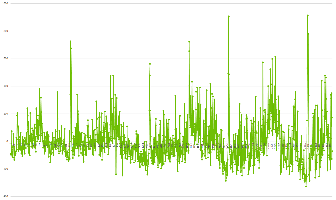 Chart 3: Row without trend
Search seasonality
After subtracting from the time series of the corresponding trends, you can proceed to the task of searching for seasonality. It consists of two subtasks:
- Detection of the very fact of the seasonality of the series.
- Definitions of high and low seasons - this is what has practical value.
Correlation detection
There are ready-made correlation search functions in both R and Python. We used the Pearson correlation. When working with user interests vectors, the following should be kept in mind:
- After subtracting the trend from the original range, negative values may result. This is normal at this stage.
- For our task, checking the correlation of time series at 365 days is sufficient. Yes, the influence of a leap year is insignificant and we do not take it into account.
- To search for seasonality, you must have data for at least two complete periods. Our calculations used data for four periods.
We are looking for the correlation of two vectors: X: [0; N-365], Y: [366; N]. Where N is the row length.
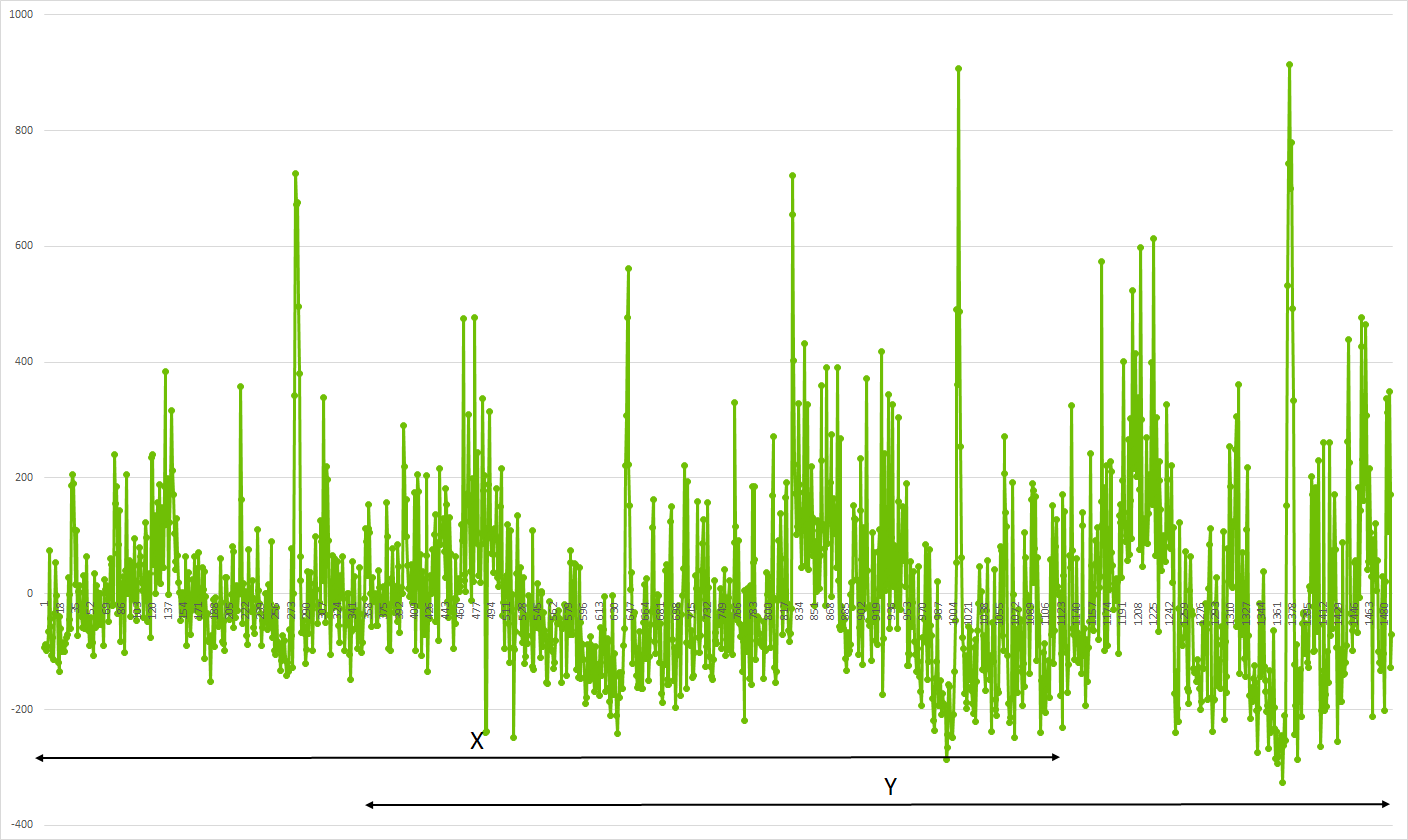 Chart 4: Correlation Detection
We get the benefit
The very fact of seasonality does not carry any practical value. You need to understand what attention to the field of activity will be in the next month: increased, decreased or ordinary.
The end result was a multiplicative scale. Where unit is the “normal” level of user interest in the business. A value other than one indicates a multiple increase or decrease in interest.
In our case [for now] a time scale of a month is sufficient. To determine the level of 1 used the median monthly attention of users. Next, a multiple deviation from this median was calculated.
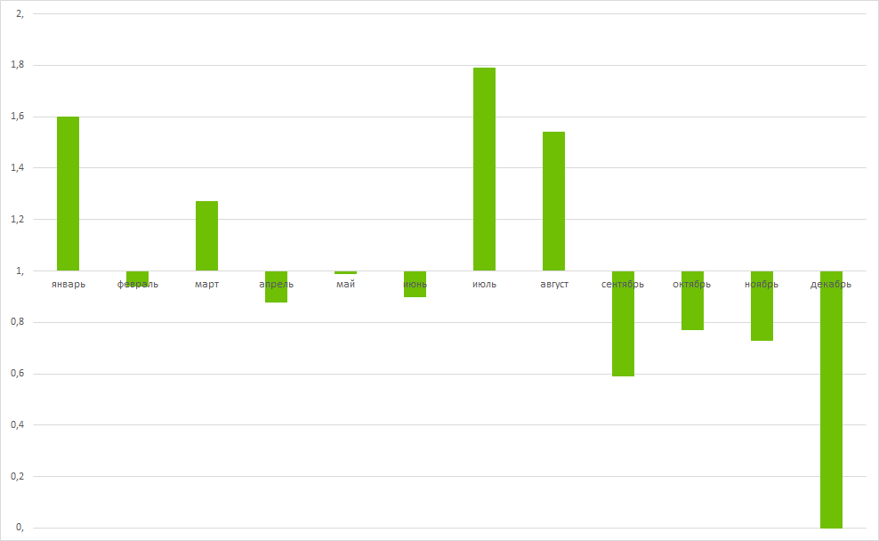 Chart 5: Annual seasonality
It's time to uncover the mystery of what data the article’s graphics show. On this and all previous graphs there are clicks to the museums of St. Petersburg. As can be seen from the last schedule, museums are popular on the January holidays, when there are many weekends, and in summer.
What if ...
... take and feed the algorithm not the interests of users, but, for example, sales?
The algorithm of actions is the same:
- Looking for trends. The audience of cities is growing, and with it the number of advertisers is growing. It is necessary to subtract the trend associated with the growing popularity of 2GIS as an advertising platform, to obtain industry spikes and recessions.
- We find sales correlations from year to year, and then high and low seasons.
It took a number of adjustments
Advertising in 2GIS is sold monthly, so they took a month for scale, but the user seasonality was analyzed to the day. For backward compatibility, we adapted the algorithms so that they work with arbitrary rows, where the X axis is the ordinal number of a point, and the Y axis has a certain value (at this level, the value semantics does not matter).
The starting point of a number of sales (origin), as a rule, does not coincide with the starting point of user seasonality. After all, first the city is gaining an audience, and only then does advertising appear. At this stage it is not necessary to combine the results of two seasonality.
Since sales are monthly, there are significantly fewer points in the rows. In this case, the correlation should be considered at 12 points instead of 365.
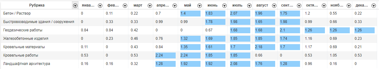 Chart 6: Seasonality of sales
As a final step, we decided to impose sales seasonality on user seasonality. Now you can see where we sell advertising later than necessary, and lag behind user demand.
For example, users are interested in purchasing concrete in Nizhny Novgorod in the period from April to October. While companies are promoting only from May to September.
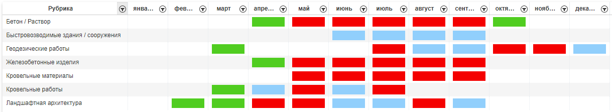 Chart 7: Intersection of user seasonality and seasonality of sales (green - user, blue - sales, red - coincidence)
What did you do
All of the above is implemented in MS SQL Server 2016. To search for linear regression and correlation, we use R, which is part of the server, starting with version 2016. And since we have Data Warehouse and user statistics analytics already on SQL Server, it turned out to be very convenient to use R for mathematical calculations.
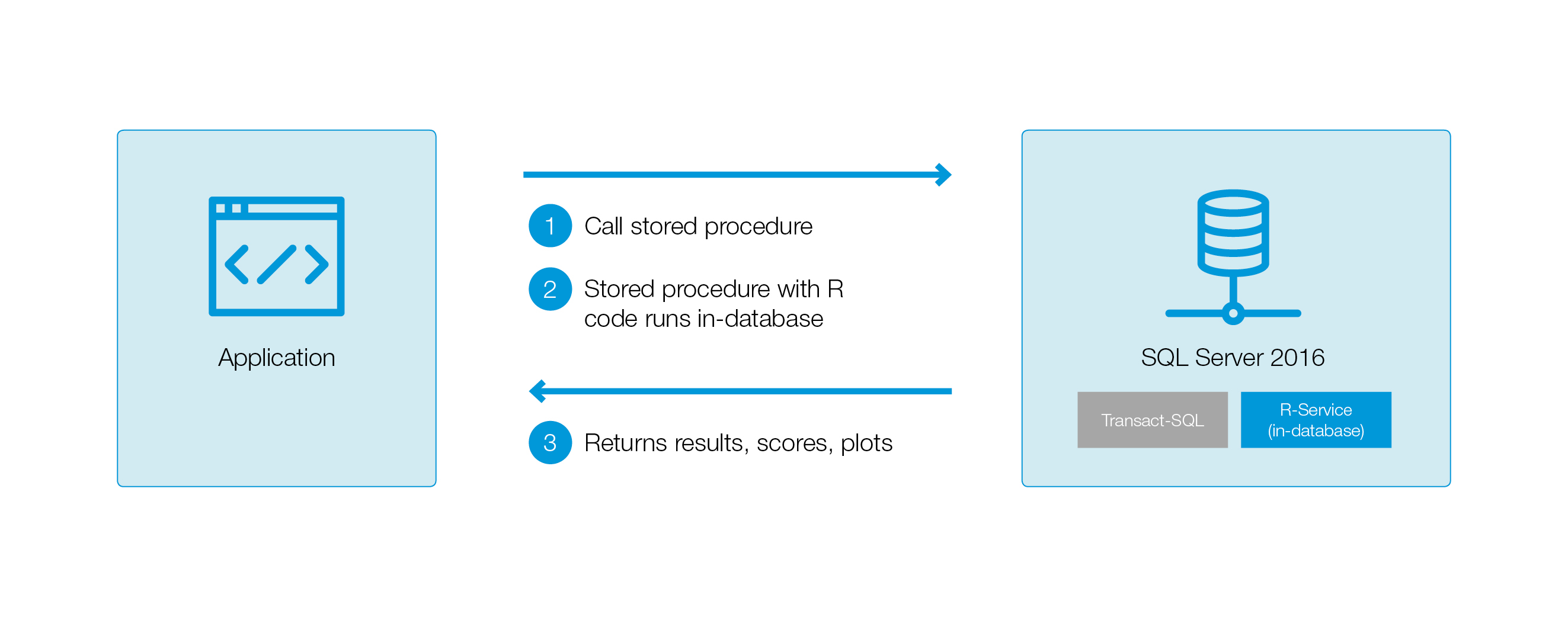
An example of using R from TSQL:
INSERT INTO
Where:
- the variable R contains directly the R-code;
- language = N'R '- indicates that the script passed to the variable R contains code in the language R. In SQL Server 2017, in addition to R, you can use language = N'Python'. Then, respectively, in the script parameter you must pass the code to Python.
- input_data_1 - contains a SQL query, the results of which within the R-code can be accessed as an InputDataSet;
- The result of the procedure will be a OutputDataSet record set, formed as OutputDataSet <- calcAllTrend (data = InputDataSet);
- It is necessary to specify the format of the resulting record: the number and types of columns. In this case, the OutputDataSet format is defined by the #tmp table, where the results are recorded. Or, you can use WITH RESULT SETS to describe the resultant recordset.
In our case, it turned out that a substantial part of the sp_execute_external_script runtime is taken directly by the R Services. The R-code itself worked quickly.
Let me remind you, we wanted to calculate trends and seasonality for all cities covering 2GIS and all spheres of activity. Therefore, we decided to transfer in InputDataSet not one row (Number, Value), but several at once, grouped by DataId. A cycle of DataId organized inside R. Thus significantly saved on the call service R Services.
Life facts
You have read the article to the end, it is commendable. To entertain you before the results, we share interesting facts revealed during the seasonality analysis.
Fact №1
Motorists know from personal experience that the season of searching for tires and tire fitting is spring and autumn. But, to be precise, the season in different cities can be very different. Therefore, when forming collections and dashboards (start screens in products), it is important to take into account the seasonality in each particular city.
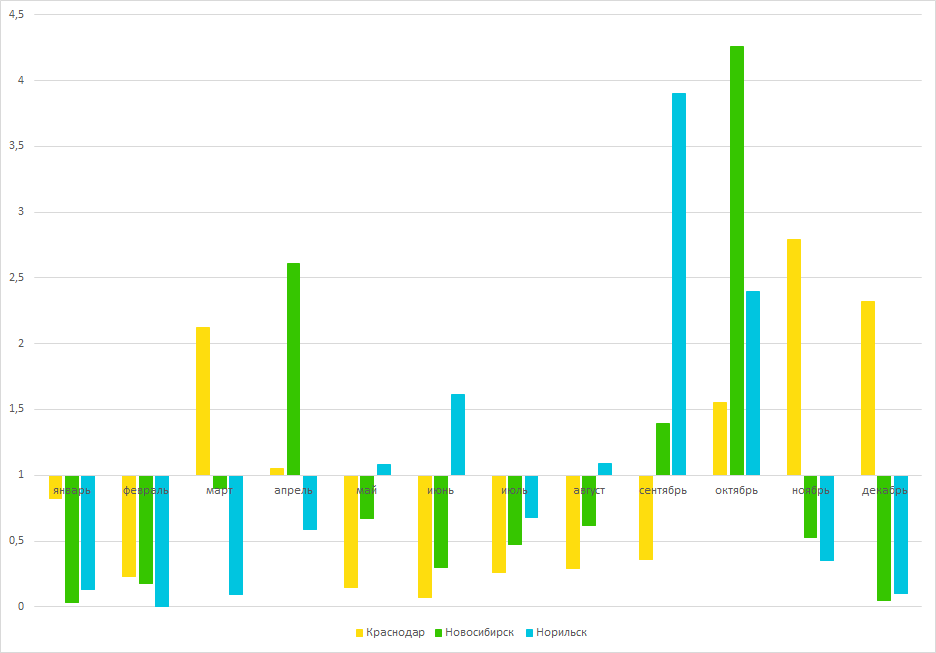 Chart 8: Seasonality of tires in Krasnodar, Novosibirsk and Norilsk
Fact number 2
Seasonality can vary even within the same field of activity - on different types of devices. For example, "New Year's gifts" on the big screen begin to look for in October. Whereas in mobile versions, the search starts a month later and the peak falls closer to the New Year.
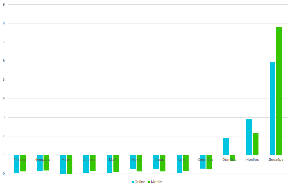 Chart 9: Search for Christmas gifts online and the mobile version of 2GIS
Fact number 3
In the process of working on seasonality, we discovered a field of activity, the interest in which occurs once every three months. And this is true for different cities of Russia.
Try to guess what this field of activity is.
Hint spoilerStrongly different cities of Russia. This means that neither the weather, nor the region, nor local businesses, but something globally common.
3 months = quarter. Pay attention to April ...
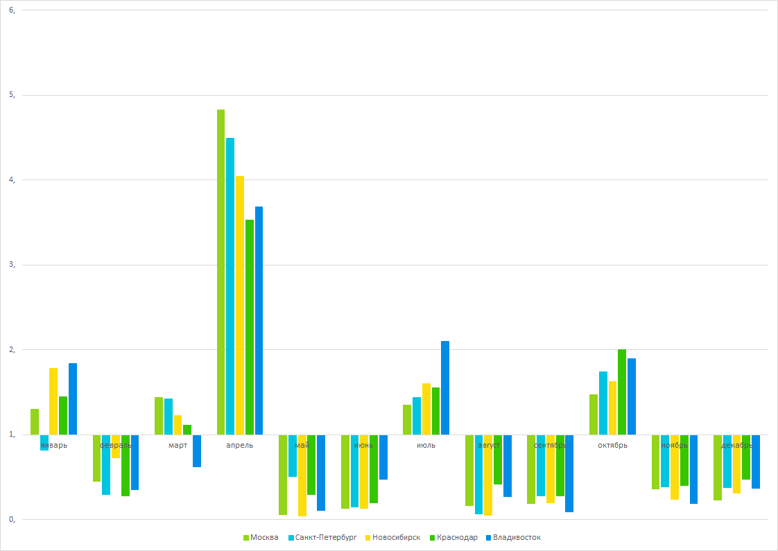 Chart 10
AnswerThese are social insurance funds - quarterly reports are submitted to the FSS once every three months, and the April peak is due to the change in reporting forms from January 1 of each year.
Once again about the main thing
Are you going to look for correlations in the data? Do not forget to prepare these data: process gaps, clear from trends and emissions. Keep in mind that preparation will take most of the time.
At the stage of working with rows, abstract as much as possible from the semantics: work with the value and the ordinal number of a point, then the code will be easier to reuse. Very much help visualization at each stage of processing.
PS: the task of searching for trends and seasonality was made as part of another task - predicting changes in user attention after purchasing advertising in 2GIS. Ready to tell you how we made a prediction if you would be interested.