The digest collects fresh articles on interface design, as well as tools, patterns, cases and historical stories since 2009. I carefully filter a large stream of subscriptions so that you can upgrade your professional skills and better solve work tasks. Previous issues:
April 2010-April 2018 .
Patterns and best practices
Margaret P and Doug Kim from Microsoft suggested the Design Considerations framework, which helps to competently design notifications and other interruptions to the user's main activities. Excellent checklist and overall approach.
One of the new interesting interface patterns is the prediction of the movement of the mouse cursor to an important element on the screen. Mary Lou shows several examples of implementation - it helps save time and effort.
Mass mailing services to meet the requirements of European legislation, the GDPR became the main meme of the end of May. Unfortunately, many did it extremely clumsy, so that the Internet acquired the features of a bureaucratic office, where people have to fill in endless and not very clear forms. The site has collected the most miserable approaches to solving the problem.
Bonus: A small
instruction on how to take into account the requirements of the GDPR in the design .
Design Studio Creative Navy talks about his experience in designing POS-interfaces for cashiers. A good overview of the features of use and best practices.
Part 2 .

John Ogata and JonDelina 'JD' Buckley compared conventional paper instructions and more modern ones using augmented reality. This AR use scenario promotes each new generation of devices and it really reduces errors and speeds up the process.
Collection of interface patterns in the form of video records of passage through scenarios.
A collection of dark patterns that develops the ideas of Harry Brignull, the main evangelist of this theme. He himself says recommends this site because he does not have time to update his own.
Kate Meyer from Nielsen / Norman Group gives advice on the proper implementation of search prompts in the interface.
John Moore Williams from Webflow scoffs at the comical error messages.
Kendra Schaefer has gathered for Icons8 examples of schizoid functions in Chinese mobile applications.
Khoi Vinh went to the AppStore for many months and took screenshots of illustrations for editorial collections. This is a rather rare approach in quality when illustrations are prepared in such a volume, with such diversity and in such quality.
Board in Pinterest .
Baymard Institute Studies
Edward Scott recalls that
it is important to ensure comfortable viewing of photos in landscape mode. And
Design systems and guidelines
Google showed the updated Material Design 2.0 design system at the I / O conference. This is a major change in the visual style and expansion of the toolkit, the first bells of which
appeared in March .
Visually, Android P continued its convergence with iOS (the differences between the platforms are
erased on both sides):
There are many rounds , which strongly correlates with iOS 10-11. Perhaps this is done with an eye to frameless telephones, which are becoming more and more - this is better combined with their rounded edges of the screen.
 The mood color is white
 . There is no longer a bright cap of the application and gray substrates, a solid white space with a minimum of accents. In some Google applications, there is a
colored bottom panel and the
idea of accent colors does not leave the guidelines , but the trend is clear (including the
Gmail web and
Drive ).
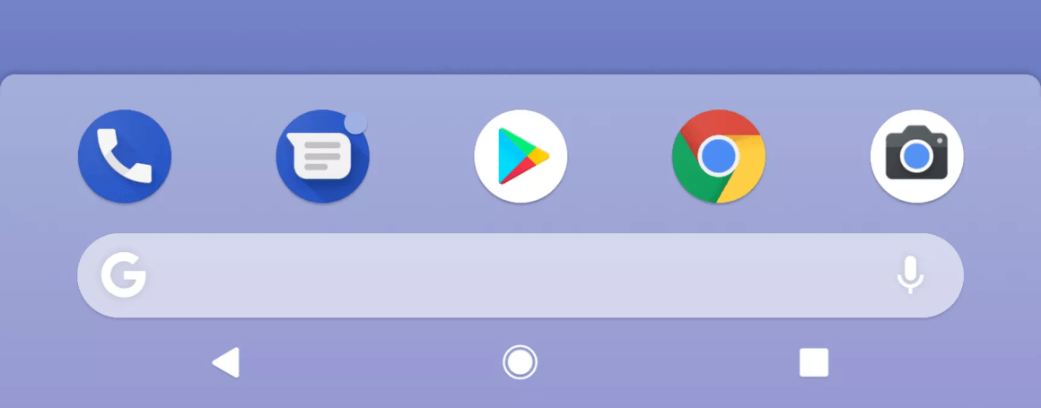
 Navigate the OS in the spirit of the iPhone X. The “grip” pattern
 instead of the “home” button with almost similar mechanics, the rejection of a separate application list button (also called by swipe from below), well, the lower navigation bar that has become official in recent years. All this helps to manage modern phones, which have become not only bigger, but also higher due to framelessness. By the way,
in some new Google applications, navigation tools are almost everywhere below . It remains to simplify the "back" button (it has already disappeared from the home screen).

You can call it a taste, but the first version of Material Design had its own face and it was possible to talk about the character of the brand, expressed in the interface. Someone complained that the guidelines are too hard and make applications identical. But for many companies it was a strong reference point - how can you create a feeling of unity of products without using a logo. Although it will be easier to maintain two platforms.
On the other hand, Material Design now supports more
advanced themes , than just a color change. You can change the font grid, the rounding of interface elements (more precisely, even their shape - for example, you can make diagonal bevels), icons. This includes a
plugin for Sketch (you can quickly try on the style on your layout) and an
icon library (in five styles).
Recently updated Google products also use this approach (although their style is just emasculated).
material.io/design/assets/1b7zteqiB7LCxy1R_NQwQZZ3_c8JqLE7T/theming-overview-applyingtheming.mp4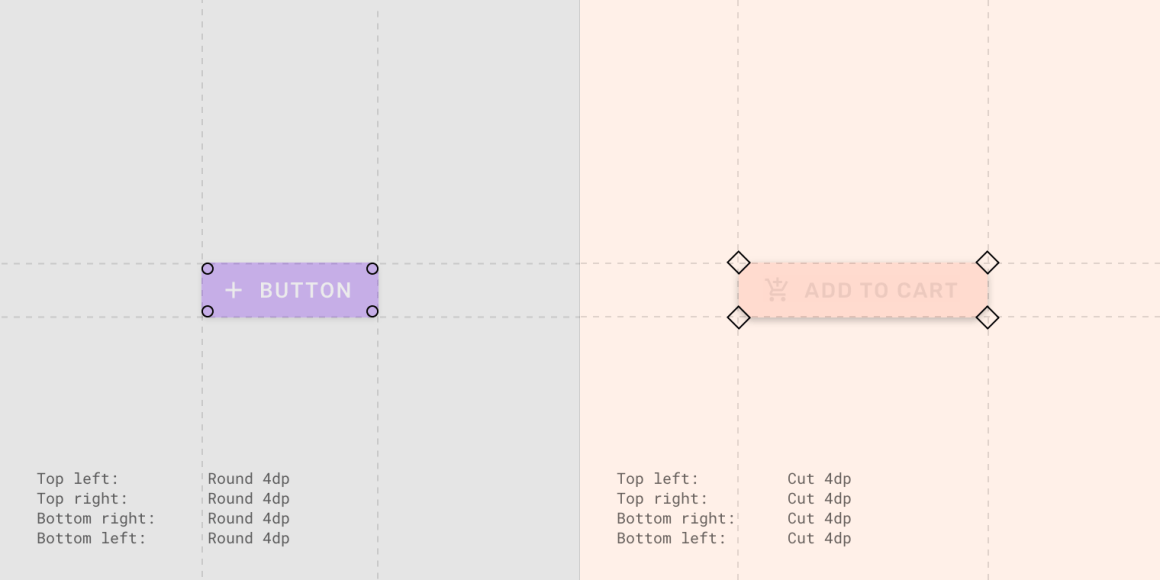
And the most important thing is that now it is a full-fledged design system
with components in the code , and not just large-scale guidelines and templates for them with some separate examples. These components also support the thematisation, so that the system looks complete (the components themselves began to appear a year ago). The new site
Material Design made the focus on two components - design and development - more pronounced. They also launched the long-promised
Gallery tool, an analogue of Zeplin and Wake. But this is somehow sluggish against the background of promises made after the purchase of Pixate (the founder went to Figma) and Form (Google confirms the reputation of the rotator of the purchased companies).
From other interesting details of the announcement:
Four colors of the logo as the basis of the visual language . It worked out well in Gmail for the web - the “+” icon and the colors of the indicators clearly inherit the idea.
 New style of Google illustrations
 .
It seems that
for their products, the company will switch to the Google Sans font .
 Self-restrictions on the use of the phone
 and
individual applications . The user himself sets them, after that the application becomes black and white, motivating to stop. At night, the phone completely goes into this mode. The company launched a separate
Digital Wellbeing initiative.
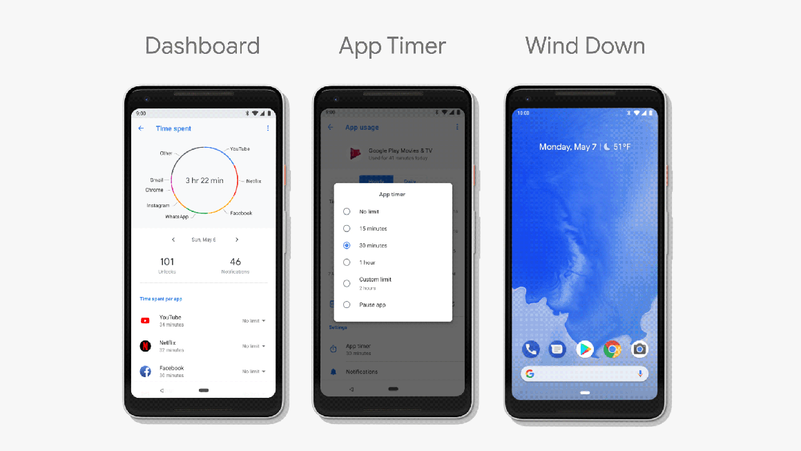 Easier to configure the frequency of notifications
 . If the user repeatedly hides the notification from the application without reading, Android will offer to hide it altogether.
Pixel Buds headsets can read some voice notifications .
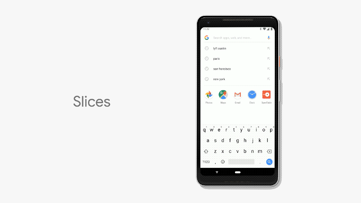
Integration of third-party applications into search results and context menus as
Slices and
search by the highlighted word .
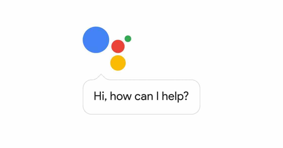
 Google Assistant can call and book a restaurant
 .
Mobile hrome will support augmented reality .
Experimental camera Google Lens has learned to do more and
become part of the standard application .
The beta version can already be put on some phones . The final version will appear in the fall. Roll up sleeves, there will be a lot of work.
By the way, come useful tools:
Thomas Lowry has assembled the
UI Kit Material Design 2.0 for Figma , which supports the theme.
Rachel Andrew also made an excellent
overview of the main materials for designers and developers to upgrade applications to Material Design 2.0, Android P and other devices.
Studio Oleg Chulakova published its design system. So far, it covers only the site of the agency itself and related subsites, but it’s great when they realize their importance in client work and invest in their future - the same Brad Frost began atomic design as a solution for client projects.
One of the first in RuNet was made by the Manufactory for client sites . This well shows that not only giant grocery companies are capable of design systems, now there are enough tools for a low start.
Other examples
Hudl : a very
clever example with a good structure and coverage of design principles.
Intercom's Kristy Marcinova shows
pieces of the Intercom
design system , which has not yet been published outside.
He earned a website about the design systems from Figma, which they announced six months ago. In support of this, they conducted a
series of meetings around the world . However, so far this is a dozen not very deep articles, so that it looks of little use against the background of a general movement. Of the relatively interesting things, the
opinions are for and
against the fact that design systems reduce the need for designers.
Jeremy Wilken describes the new versioning system for the VMWare Clarity design system.
An excellent story by Lara Tacito about the process of the work of the design system team in HubSpot. The stages of work on the conditional component and the internal tools for interaction between designers and developers are well disclosed.
Nathan Curtis tells you how to write simple instructions for developers on how to use a design system.
Varun Vachhar talks about working with the Tachyons CSS framework for design systems.
iOS
A visual memo on the permissions of the iPhone from the creators of the tool PaintCode .
Understanding the user
Julie A. Kientz, Lisa Anthony and Alexis Hiniker share their experience in designing interfaces for children. They give good practical advice on the features of such interfaces.
Information architecture, conceptual design, content strategy
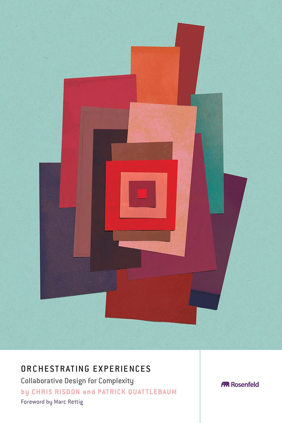
Rosenfeld Media has published the book by Chris Risdon and Patrick Quattlebaum Orchestrating Experiences. It is dedicated to designing a user interaction map with a product in a broad sense, and the authors tried not to limit themselves to digital products or services.
Page Laubheimer of the Nielsen / Norman Group writes about the problems of displaying in navigation pages that are linked to several categories at once.
Kay Dale and Ignacia Orellana describe 10 key service design principles from the Gov.uk team.
Design and design of interface screens
In the new version, the team focused on fixing bugs and improving performance. This and the next release will be about combing existing functionality to make it easier to jerk strong.

Plugins and articles
Overflow to create info cards: a public beta has been released .
Mark Grambau shows a
schizoid, but entertaining way to change the colors of icons in the Sketch library .
Figma
Announced the division of styles into variables . This is one of the most important steps to link design patterns and components in the code - now most of the tools do not have modularity for describing symbols and components.
Adobe XD
May update . There was a free version (one public prototype), an
investment fund of $ 10 million was opened for the creators of plug-ins and extensions, a quick replacement of characters and bulk insertion from the buffer, finalizing imports from Photoshop and Sketch.
A new tool at the interface of web interface design and development. It allows you to clearly outline the layout of the screen, using a library of components from the design system in the spirit of Framer.
Announcement .
Invision
Announced a
platform for plug-ins to Studio . Like Adobe XD, they will give grants to the best developers from their
Design Forward Fund . The entry threshold for new tools has increased again, now all 4 key players call themselves platforms - Adobe, Figma, InVision, Sketch.
Marvel
The tool
opened the API and also became a platform . The first
integrations are fairly basic - Slack, Dropbox, Sketch. Of the really interesting are
Maze (usability testing based on Marvel prototypes), Lookback and Niice (mindboards).
Another tool for designers that promises to export layouts to code. Comes with analytics and other useful nishtyaki.
Haiku
Launched a
gallery of custom projects .
For what and how it works .
Avocode
We have released a
report on the popularity of certain methods of working with layouts for 2017 . Designers began to use less layers and more version control systems.
Phase
The first version will focus on creating dynamics . In the second they promise
quite complex adaptability . They are also preparing the launch of
Phase Magazine .
Co-founder Nick Budden spoke at the
Mail.Ru Design Conference 2018 and spoke about the upcoming release. The video is still being mounted (a
piece of unprocessed ), but its colleague Vlad Shvets described its main theses in Russian. By the way, Nick managed to call on half a dozen local design teams, so the tool evangelists will be more.
Spirit
Mac version released.
Fuse
The tool has become free and open source .
Modern editorial CMS
Sophia Ciocca talks about creating an editor for the CMS NY Times .
The service makes a simple presentation of a simple interface screenshot for a presentation or site.
A collection of interface elements in HTML and CSS for styling prototypes for paper sketches.
Pasquale D'Silva talks about rationality and moderation in interface animation. He provides motion graphics for different approaches, which allows for a better understanding of the nuances.
Alexander the Brave compared modern prototyping tools.
Marc-Oliver is working on Ubuntu and has described its criteria for good interface documentation.
User research and testing, analytics
Zoe Dimov describes an approach to involving members of the product team in user research. This is important in the modern process of creating products, where time is short and a common understanding of the problems of the market and the target audience is important.
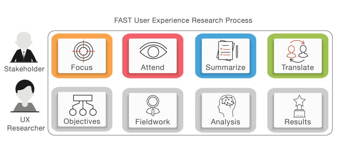
A group of user researchers from Indeed gives advice on optimizing the user research process in the agile process.
Bonus:
similar tips from LaiYee Ho .
Jeff Sauro makes recommendations for comparative user research - with which indicators for the market you can compare the metrics of your product.
Raluca Budiu from the Nielsen / Norman Group about user research where different tasks are given to the same or very different respondents. In the end, she compares the pros and cons of these options. The first is cheaper, the second gives less noise.
Jeff Sauro compared remote usability testing services. His company launched its own MUIQ, so he notes its benefits.
Sven Jungmann and Karolin Neubauer talk about the features of user research in the field of health. How to make them comfortable for patients and doctors.
Deliveroo's Melissa Safran talks about unusual approaches to user research that the team has been using lately.
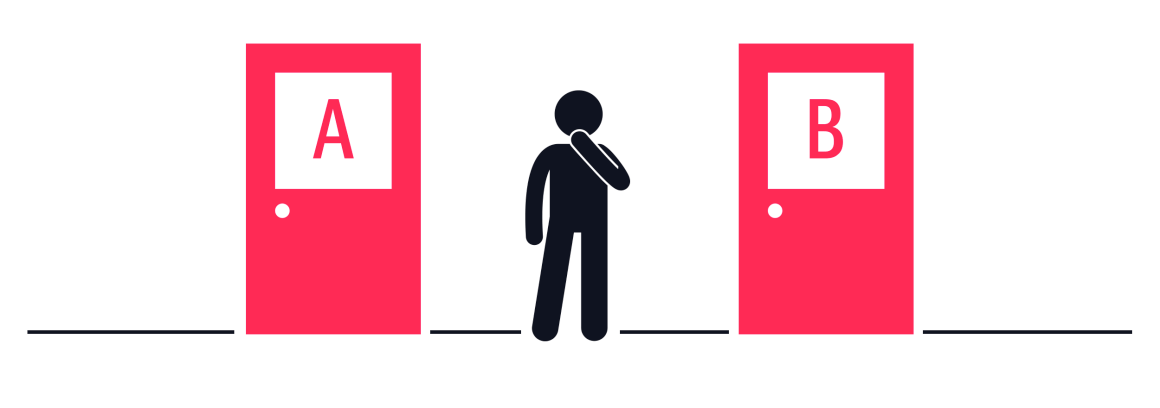
Oleg Yakubenkov talks about worsening A / B tests. This is a quick and cheap way to check if the target metric can be affected at all. For this, a design variant is made that is clearly worse than the current one - this will show whether the existing version works better than it.
Jeff Sauro wondered how you can compare metrics obtained during moderated and unmoderated remote user studies. The success of tasks is comparable, but the execution time is not in favor of unmoderated ones.
Visual programming and browser design
Bootstrap
The online tool
LayoutIt allows
you to quickly sketch a grid of blocks for Bootstrap.
New scripts
Library for interface animation in javascript and webgl .
CSS pattern generator .
Announcement .
The implementation of the picture of the XVIII century CSS .
A selection of experiments with a spectacular design on pure CSS .
Web typography
Airbnb made their own font Cereal. Karri Saarinen talks about
how the team optimized it for interfaces .
Announcement .
IBM's Lehel Babos
shows how a typographic scale can be calculated in design systems. He relies on classical principles, but shifts them to CSS.
Adaptability
Lea Verou gives advice on the layout of adaptive tables .
Print versions
Rachel Andrew describes current approaches to print versions of sites .
CSS Shapes and CSS Magazine Layout
An overview of the current CSS features for magazine layouts and simply interesting design sites from Zell Liew .
Work with color on the web
As a design team, Salesforce
selected color palettes to visualize data in a design system .
GE Hans von Sichart tells how the design system team made a
harmonious and extensive palette of gray colors for use in professional software with a bunch of dashboards .
Rahul Chakraborty describes several approaches to creating a color palette for an interface .
Translation .
Marcin Wichary shows
how to make a dark design theme for a site by changing key variables in CSS .
CSS animation
How to use CSS motion path for interface animation .
Metrics and ROI
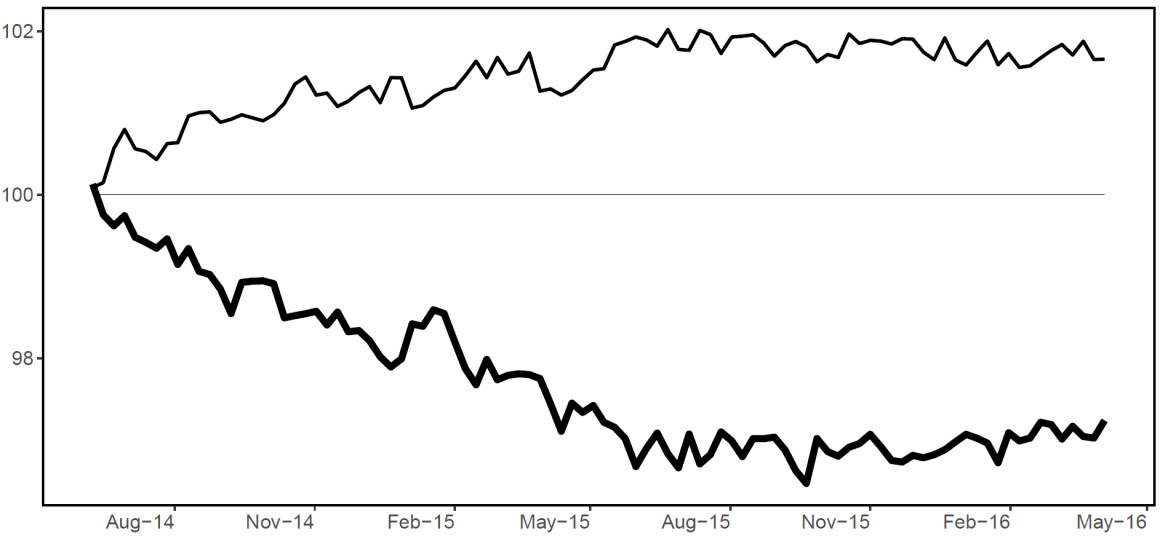
Jakob Nielsen has long tried to find evidence that excessive advertising reduces user loyalty and leads to their outflow. Service Pandora conducted a long study on this topic in 2014-2016, and its results confirm the hypothesis.
Jeff Sauro examines how the top estimates of user surveys are able to predict customer returns, and the lower estimates of outflows. Several studies to which he refers confirm this.
Alexander Osterwalder provides metrics for evaluating the success of innovative initiatives.
UX strategy and management
An excellent article by Alastair Simpson about the three stages of growth for a design manager: first experience managing designers, managing other design managers, and working with an entire product portfolio. He gives advice on how to behave competently on each of them.
Part 2 .

Julian Shapiro gives a pack of advice to owners of design studios on the competent organization of work on projects and business in general. Interestingly, his vision of project work is similar to the work of grocery teams.
Dave Malouf describes the value of the design team for the company in several sections. The result was a checklist on organizational matters.
Interview with Eik Brandsgård from LEGO on the implementation of the practice of design sprints in the company. They decided to make revolutionary, not evolutionary, changes and launched a simultaneous process with dozens of teams. For this, we had to suspend the entire work for two months, but according to him, the result was worth it.

Sarah Gibbons from the Nielsen / Norman Group talks about the design decision prioritization matrix and gives step-by-step instructions for completing it.
Product management and analytics
Anna Buldakova talks about the roadmap format in Intercom. They have three features: a roadmap is not about solutions, but about goals; roadmap is not about planning, but about priorities; Roadmap is not about external, but about internal communication.
Methodologies, procedures, standards

One of the best materials on the topic of healthy criticism of design thinking. Jon Kolko begins with the prehistory of the emergence of the main components of the methodology, and then cites opinions for and against what is happening around this buzzword now. It turned out one of the most balanced articles on the topic with excellent conclusions.
Cases
Microsoft released the Xbox Adaptive Controller game controller for gamers with disabilities. The article details the issues, the work on the device and the community of such users.

The misadventures of the company continue. For continued growth of the user base, Snapchat, it was important to make the interface more understandable. True, the
first redesign, on the contrary, slowed down the growth , so we had to urgently
redesign it . It turns out that the product team, including the designers, warned the CEO about potential problems, but he made a strong-willed decision.
Bronwyn Gruet shows how the Creative Market made a modular guideline on illustrations with a collection of typical objects. Her colleague
Daniella Valerio writes about the principles of the color palette .
Michel van Heest tells how he created the service Shortcuts.design.
Trends
Market Statistics (I quarter 2018)
-6.3%
fall in smartphone sales in Europe+ 25.4%
increase in sales of smartphones in Russia+ 1.3%
increase in sales of smartphones in the world× 2 and × 3
sales growth of smart watches and bracelets in Russia (in pieces and money)20% of
American families have a smart column.1.8 billion
monthly YouTube audienceAlgorithmic design
The service allows you to imitate the voice of any person.
Rama Allen of The Mill reflects on the subject of art during the boom of artificial intelligence. , .

David Dao .
Sougwen Chung , . , - .
Yuqian Zhou Bertram Emil Shi , .
Christian Noessel .
.
-, .
Aalto University Kochi University , .
Review .
Google Assistant.
:
Cathy Pearl Google .
Memo Frederik Goossens on the design of voice interfaces .
IBM .
Mark Vitazko Microsoft .
O'Reilly John Alderman Christine W. Park «Designing Across Senses».
1 , . . , .
For general and professional development
. Red Collar
.
 David Travis from UserFocus wonders if the user researcher should invest his time and money in a master’s degree. In general, it is debatable, often getting more practical experience is a big salary and more knowledge.Jason Yuan tells how his career changed after the publication of an unsolicited Apple Music redesign (spoiler: in the end, they took him as an intern at Apple, although they didn’t want to).A catalog of side projects that a designer or developer can fit into.
People and companies in the industry
Blog design team Contour. In one of the most recent articles,
Alexander Khramtsov talks about sketch templates , and
Emilia Gorodov on the features of conducting user interviews in the company .
A series of interviews with interface designers in the gaming industry.
Conference proceedings
List of design and development conferences.
The online conference was held February 13-16. UXPin posted a video from it.
The Enterprise UX 2017 conference was held June 7-9 in San Francisco, USA. Review of the
first and
second day of performances from Pabini Gabriel-Petit.
Subscribe to a digest on Facebook , VKontakte , Telegram or by mail - there fresh links appear every week. Thanks to everyone who shares the links in the group, especially Gennady Dragun, Pavel Skripkin, Dmitry Podluzhny, Anton Artyomov, Denis Efremov, Alexey Kopylov, Taras Brizitsky, Yevgeny Sokolov and Anton Oleynik.